InPrint 4
Make books, activities and accessible documents with Widgit Symbols
This manual will guide you through all of the features of InPrint 4.
Support
You can also find a growing range of support materials on our website:
www.widgit.com/support/inprint4
If you have any questions, you can contact out friendly support team for assistance:
T: (+44) 1926 333680
E: [email protected]
Copyright
Copyright © Widgit Software Ltd 2024. All rights reserved.
Version
This manual is for version 4.0.
Overview of InPrint 4
InPrint 4 is a desktop publisher for creating symbol materials to print, such as symbol books, flashcards, worksheets and accessible documents.
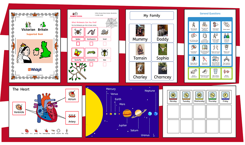
InPrint 4 uses Widgit’s smart symbolising technology and is supplied with more than 20,000 Widgit Symbols, which have been developed to support communication, access to information and many school curriculum subjects.
New powerful features Easy to use templates Personalise your documents |
|
New Features of InPrint 4
InPrint 4 has been redeveloped from the ground up. You can do everything that you could in InPrint 4, but in much faster and simpler ways.
Quick Start Create Toolbar
|
Create frames, speech bubbles and tables. Access images from your computer or the new Widgit Media library. All from one handy Create toolbar. |
New Table Controls
|
Creating and editing tables is now much easier and more intuitive.
|
Add Images in Many Ways
|
You can add images to your InPrint 4 documents from a number of sources, either as replacement symbols or as paragraph graphics. From the Create toolbar, you can choose to add your own images from your My Pictures folder, browse for pictures saved elsewhere on your machine / network or choose from over 4000 Widgit Media files pre-installed with InPrint 4. You can also copy images from the web and paste them directly into your documents. |
When you select an image, the Image tab will appear at the top of the screen. From here you can flip, rotate and resize the selected image. You can add a border or background colour. For symbols and Widgit Media graphics, you can edit the colours.
Intuitive Interface

InPrint 4 has an all-new intuitive interface, giving you full access to all the features of the program.
The tab bar, which runs along the top of the screen, contains multiple tabs with controls for different aspects of the program.
There are two types of tab:
-
Static tabs are always visible
-
Dynamic Tabs only appear when you have certain items selected. These tabs are coloured.
Brand New Widgit Media

InPrint 4 gives you access to more than 4000 Widgit Media graphics as well as over 15,000 Widgit Symbols. Widgit Media graphics are beautifully drawn and cover a wide range of subjects. They can be used as illustrations in your resource or combined to build up scenes.
Visual Page Management

The Page Managerprovides quick access to browse and manage your document.
-
See thumbnails of all pages
-
Add, delete and duplicate pages
-
Drag and drop to reorder pages
-
Change from single page to book mode
Pinned Styles
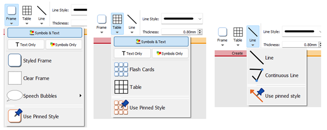
If you need to create frames, tables, or lines with the same appearance again and again, you can 'pin'the style to save you from having to make the same changes each time. Simply right-click on a frame, table or line and select 'Pin this Style'.
New Symbolisation Controls
|
Smart Symbolising recognises the part of speech for each word as you type, helping you to pick the correct symbol in moments. |
Combine words and combine symbols to make sentences clearer.

Templates

InPrint 4 comes with a wide variety of ready-made templates that you can use as starting points for your resources. Templates are a big time-saver when resources you are creating on a daily basis have the same structure and format.
Resource Packs

Widgit publish a range of symbol-supported learning materials and symbol stories, including extensive topic-based packs 'ready to go' for special and mainstream education, health care, and home use.
InPrint 4 comes with a number of pre-installed resources packs that you can print out or customise.
Quick Access to Files
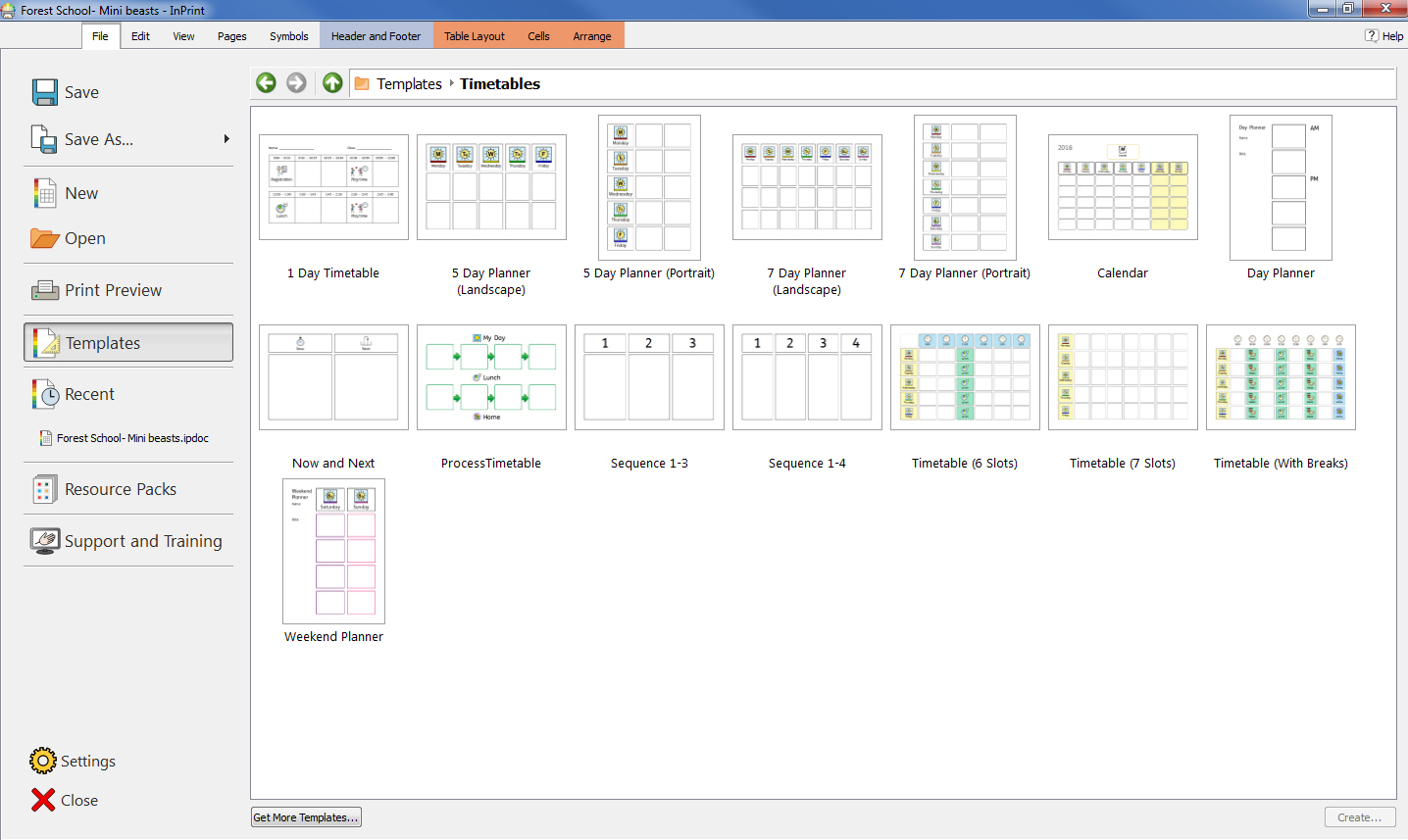
The File tab uses thumbnails to give you quick and easy access to:
- Ready-made templates that you can use as starting points for your resources
- Ready-made symbol supported learning materials
- Quickly find and open your recent documents
The Symbol Chooser
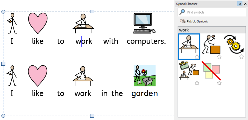
As you type, the Symbol Chooserdisplays the available symbols for your content.
You can use the symbol chooser to set defaults for your favourite symbols, or to search for symbols to add your document as images.
The Image Library
|
The Image Libraryprovides you with quick access to the images on your machine or network as well as over 4,000Widgit Media files. By default, the image library contains links to your 'My Pictures' folder, 'My Computer' and the Widgit Media files, but you can personalise the Image Library by adding shortcuts to your most commonly used images and folders. If you have a lot of different folders that you like to use images from, you can create a list of favourites. |
Symbol Spell Checker
|
Simple Spell Checker See suggestions for a spelling error by right-clicking on it. Full Spell Checker The dictionary is fully customisable with your own vocabulary and common mistakes. |
Enhanced Layout Tools

The Arrangetab includes a number of tools to help you organise objects on the page.
You can use the Arrange tab to:
-
Order objects i.e. move items to the foreground, middle ground, and background
-
Align objects along a specified axis, horizontally or vertically
-
Distribute items evenly, horizontally or vertically
-
Combine several items into a group so that they are treated as a single unit
Right-Click Context Menu
|
You can access the most common features of the program by right-clicking on an object to open the context menu. The available options in the context menu will change depending on the type of object that is selected. |
Sizing Types
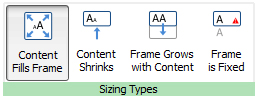
InPrint 4 has new Sizing Typesfor frames, tables and speech bubbles to give you greater control over how their content behaves:
-
The content shrinks and grows whenever an object is resized with Contents Fills Frame
-
The content tries to remain at your preferred size with Content Shrinks
-
The object grows as you type with Frame grows with Content (not available for tables)
-
Content that does not fit in the object is hidden with Frame is Fixed
Tips for InPrint 2 Users
InPrint 4 can be used to make all of the same resources as InPrint 2 but in much faster and simpler ways. Below is a list of common features found in both versions with an explanation of what's new.
Creating a Table
InPrint 2
To make a table with InPrint 2, you had to create a frame, then select the option to turn it into a table from the 'Frames and Pictures' menu. From there, you could specify the number of rows and columns and other properties of the table.

InPrint 4
With InPrint 4, creating tables is far simpler and much quicker.
|
To create a table, click the Table button on the Create toolbar on the left of the screen. From the Table menu that appears, you can:
|
|
When you have selected the type of table that you would like to create, the table creator will appear under your mouse pointer, showing you the number of rows and columns and the total number of cells that will be created. Drag the table creator to the dimensions you require and click once to confirm your choice. A preview of the table will be attached to your mouse pointer so that you can see exactly where it will be when you click to place it in on the page. |
Create Table from Frame
|
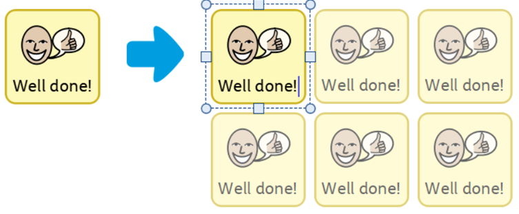
You can also create a table of identical cells. This is particularly useful for creating sticker sheets. Create and style a frame with the desired content. Select Create Table from Frame, then move your mouse until you see the desired number of cells. Then left click to confirm. |
Creating Frames
InPrint 2
To create a frame in InPrint 2, there were different buttons that you could click to create frames with different content modes:
 |
Free Symbol frame for writing freely in symbol supported text. This frame expands as you write to fit the contents. |
 |
Fixed Symbol frame has a fixed size so that its contents are automatically sized if necessary to fit into the space. |
 |
Free text frame that will expand as you write to fit the contents. |
 |
Fixed Text frame where the text is sized to fit. |
 |
Speech Bubbles - Text only content by default. |
InPrint 4
InPrint 4 has simplified this process with all the above options as well as the new 'Pinned Style' feature available at the click of a button.
|
To create a frame, click the Frame button on the Create toolbar on the left of the screen. From the Frame menu that appears, you can:
One you have created your frame, you can change its Sizing Type, which controls the way that the size of the content behaves as you type. |
Grow to Fit
InPrint 2
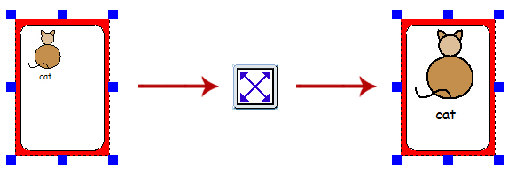
With InPrint 2, users had the option to use the 'Expand to fit' button to make the text and symbols they had used as large as possible in the frame. This was a useful feature if one of the fixed writing frames had been resized and its content looked relatively small.
InPrint 3

InPrint 3 includes new Sizing Types for frames, tables and speech bubbles to give you greater control over how their content behaves:
-
The content shrinks and grows whenever an object is resized with Contents Fills Frame
-
The content tries to remain at your preferred size with Content Shrinks
-
The object grows as you type with Frame grows with Content (not available for tables)
-
Content that does not fit in the object is hidden with Frame is Fixed
Changing Between Symbols and Text and Text Only Mode
InPrint 2
With InPrint 2, the content mode of a frame or table could be changed at any time by clicking the toggle button on the right-hand toolbar:
 |
Indicated the paragraph was in Symbols and Text mode. |
 |
Indicated the paragraph was in Text Only mode. |
Alternatively, users could use the F10 key to toggle between the two modes when an object was selected.
InPrint 4
|
With InPrint 4, users can switch between the two modes using the options on the dynamic tab associated with the selected object. For example, if you have a Frame selected; the Contents option will be on the Frames tab. If you have a speech bubble selected, they will be on the Speech Bubble tab. InPrint 4 also has a new contents style, Symbols Only. In this mode you can type in text, but when you click out, you will just see the symbols. Users can still use the F10 key to toggle between the different modes when an object is selected. |
Changing the Word for a Symbol
InPrint 2
To use an existing symbol, but change the text that appears beneath it:
 |
Type the word(s) for the symbol(s) you require. |
 |
Click on the text you would like to change, then click the 'Cat - Sam' button on the top toolbar. |
 |
The text that was displayed beneath the symbol will be removed, you can now enter replacement text. |
 |
After writing your replacement text, you needed to press the right arrow key to exit the re-text tool. |
InPrint 4
The process is very similar in InPrint 4:
 |
Type the word(s) for the symbol(s) you require. |
 |
Click the Change Symbol Text button on the Edit tab or press the F11 Key. |
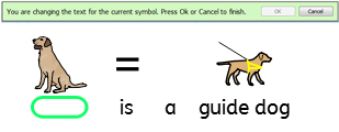 |
The text that was displayed beneath the symbol will be removed and replaced with a green box, you can now enter replacement text. |
 |
Press the right arrow key or click 'OK' in the process bar that appears at the top of the page to confirm your changes, or press Escape to cancel. |
Search for a Symbol
InPrint 2
|
InPrint 2 gave users the option to search for symbols on the Use list tab at the top of the graphic resources section. |
InPrint 4
|
InPrint 4 lets you search directly from the Symbol Chooser on the right of the screen. |
Copying and Pasting to a New Page
|
In InPrint 2, if you copied an object and pasted it on a new page, it was added in the same position. |
Headers and Footers
InPrint 2
InPrint 2 used a feature called 'master items' to allow you display the same object on multiple pages.

To make an object a 'master item', you had to select it, then go to the 'Frames and Pictures' menu and select the 'Make master item' option. You could then choose if the object was going to be editable, which page it would start to appear from, and whether or not it appeared on odd or even pages.
InPrint 4
In InPrint 4, you can use Headers and Footers to make objects appear on every page, on odd or even pages, or on a specific group of pages. If you want an object to appear on every page outside of the header and footer, you can add it to a template.

|
You can show the header and footer during editing by clicking Edit Header and Footer on the Pages tab. |
Adding Page Numbers
InPrint 2
InPrint 2 used a feature called 'master items' to allow you display page numbers.
To add page numbers to InPrint 2 documents, you had to create a frame and type the “¬” symbol (top-left on your keyboard) to act as a special placeholder for the number of the current page. To make an object a 'master item', you had to select it, then go to the 'Frames and Pictures' menu and select the 'Make master item' option.
InPrint 4
|
With InPrint 4, you can add page numbers to any frame using the options on the Pages tab. |
Note: To display page numbers on all pages, add them to a frame in the Header or Footer.
Copying and Pasting to a New Page
|
In InPrint 2, if you copied an object and pasted it on a new page, it was added in the same position. |
Headers and Footers
InPrint 2
InPrint 2 used a feature called 'master items' to allow you display the same object on multiple pages.

To make an object a 'master item', you had to select it, then go to the 'Frames and Pictures' menu and select the 'Make master item' option. You could then choose if the object was going to be editable, which page it would start to appear from, and whether or not it appeared on odd or even pages.
InPrint 4
In InPrint 4, you can use Headers and Footers to make objects appear on every page, on odd or even pages, or on a specific group of pages. If you want an object to appear on every page outside of the header and footer, you can add it to a template.

|
You can show the header and footer during editing by clicking Edit Header and Footer on the Pages tab. |
Adding Page Numbers
InPrint 2
InPrint 2 used a feature called 'master items' to allow you display page numbers.
To add page numbers to InPrint 2 documents, you had to create a frame and type the “¬” symbol (top-left on your keyboard) to act as a special placeholder for the number of the current page. To make an object a 'master item', you had to select it, then go to the 'Frames and Pictures' menu and select the 'Make master item' option.
InPrint 4
|
With InPrint 4, you can add page numbers to any frame using the options on the Pages tab. |
Note: To display page numbers on all pages, add them to a frame in the Header or Footer.
Select All
To make changes to multiple objects at the same time with InPrint 2, users first had to drag around all objects to select them.
|
In InPrint 3, you can use the Select tools on the Page Status Bar to select objects throughout the whole document. This can be particularly useful for changing the style properties of all items at once. You can select:
|
Note: When you select objects over multiple pages, you cannot move or resize them.
Smart Symbolising and Wordlists
InPrint 2 used wordlists to link the words you typed with a symbol. The symbols displayed when you type would vary according to the loaded wordlist(s) in InPrint 2.
By default, InPrint 4 uses a new smart symbolising system. When you type with symbols, the ‘smart symboliser’ analyses the words in the sentences and picks the correct symbol accordingly.
For example, if you type “drink your drink”, the symboliser will pick the verb form for the first “drink” and the noun form for the second.

With each software update, more Widgit Symbols and vocabulary will be added, ensuring that you always have the largest and most up-to-date vocabulary.
InPrint 4 still uses wordlists for resource packs, special vocabulary and third party symbols.
Topic Wordlists
Alongside the smart symboliser, you can choose to load a topic wordlist for specific or personalised vocabulary.
Symbol Set Wordlist
If you have purchased a third party symbol set such as Makaton to use with InPrint 4, it will be available as a symbol set wordlist
Opening InPrint 2 Documents
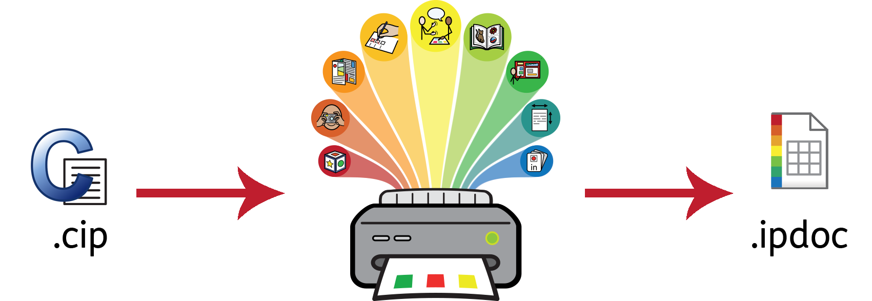
InPrint 3 will open any of your old InPrint 2 documents (.cip files) and give you the option to save them in the latest file format (.ipdoc).
To open an existing document, click the Open button on the File tab. From here you can choose to open .ipdoc files or .cip files. Double-clicking on a .cip file will import your old resource into InPrint 4 and allow you to edit it as you would any other file.
You can also open .ipdoc files or .cip files by dragging them into InPrint 4 from Windows Explorer.
Select Save As from the File tab to save the document as a .ipdoc file.
Opening InPrint 2 Resource Packs
InPrint 3 will open any of your InPrint 2 resource packs.
Click the File tab and click the Resource Packsbutton. To view the InPrint 2 resource packs installed on your machine, click the View Legacy Resources button at the bottom of the screen.
Double-clicking on a .cip file will import your old resource into InPrint 4 and allow you to edit it as you would any other file.
Select Save As from the File tab to save the document as a .ip4doc (InPrint 4 file). Please note that you cannot open .ipdoc files in InPrint 2.
If you have any problems opening your InPrint 2 files, please contact technical support: T: 01926 333686 E: [email protected]
Smart Symbolising and Wordlists
InPrint 2 used wordlists to link the words you typed with a symbol. The symbols displayed when you type would vary according to the loaded wordlist(s) in InPrint 2.
By default, InPrint 4 uses a new smart symbolising system. When you type with symbols, the ‘smart symboliser’ analyses the words in the sentences and picks the correct symbol accordingly.
For example, if you type “drink your drink”, the symboliser will pick the verb form for the first “drink” and the noun form for the second.

With each software update, more Widgit Symbols and vocabulary will be added, ensuring that you always have the largest and most up-to-date vocabulary.
InPrint 4 still uses wordlists for resource packs, special vocabulary and third party symbols.
Topic Wordlists
Alongside the smart symboliser, you can choose to load a topic wordlist for specific or personalised vocabulary.
Symbol Set Wordlist
If you have purchased a third party symbol set such as Makaton to use with InPrint 4, it will be available as a symbol set wordlist
Opening InPrint 2 Documents

InPrint 3 will open any of your old InPrint 2 documents (.cip files) and give you the option to save them in the latest file format (.ipdoc).
To open an existing document, click the Openbutton on the File tab. From here you can choose to open .ipdoc files or .cip files. Double-clicking on a .cip file will import your old resource into InPrint 4 and allow you to edit it as you would any other file.
You can also open .ipdoc files or .cip files by dragging them into InPrint 4 from Windows Explorer.
Select Save As from the File tab to save the document as a .ipdoc file.
Opening InPrint 2 Resource Packs
InPrint 3 will open any of your InPrint 2 resource packs.
Click the File tab and click the Resource Packsbutton. To view the InPrint 2 resource packs installed on your machine, click the View Legacy Resources button at the bottom of the screen.
Double-clicking on a .cip file will import your old resource into InPrint 4 and allow you to edit it as you would any other file.
Select Save As from the File tab to save the document as a .ipdoc (InPrint 4 file). Please note that you cannot open .ipdoc files in InPrint 2.
If you have any problems opening your InPrint 2 files, please contact technical support: T: 01926 333686 E: [email protected]
Starting InPrint 4
To open InPrint 4, go to the Start menu and select: “All programs > Widgit > InPrint 4 > InPrint 4” If you chose to create a desktop shortcut during installation, you can also click on the InPrint 4 shortcut on your desktop. |
|
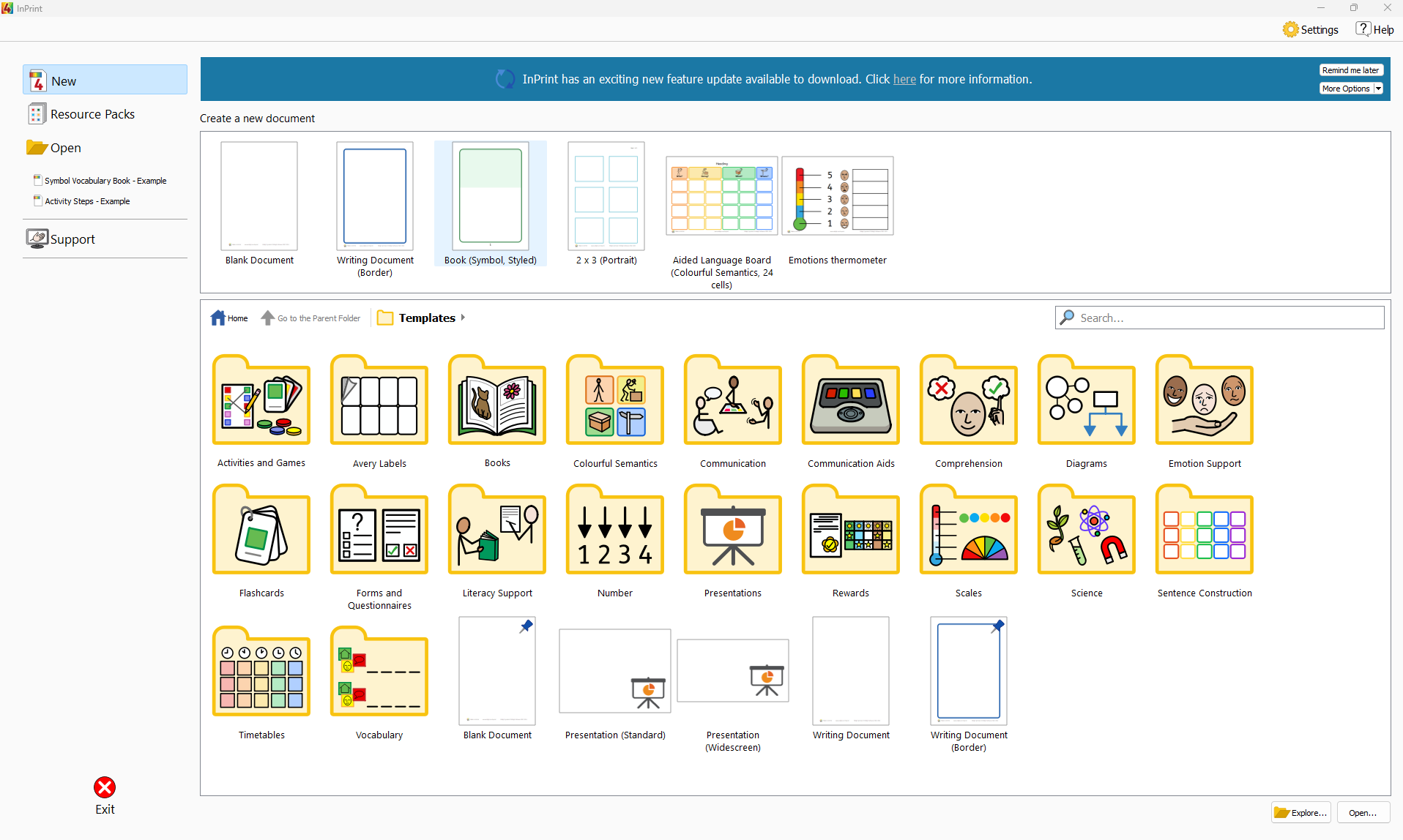
When the program opens you will be presented with the launcher screen, which you can use to open your existing documents, ready-made resource packs or choose from a range of ready-made templates.
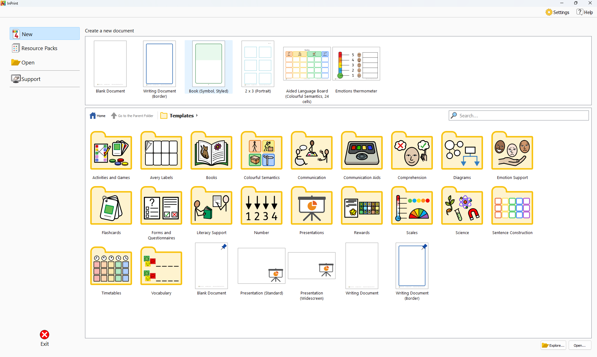
Note: The application will open automatically if you double-click on an InPrint 4 file in Windows Explorer.
Launcher
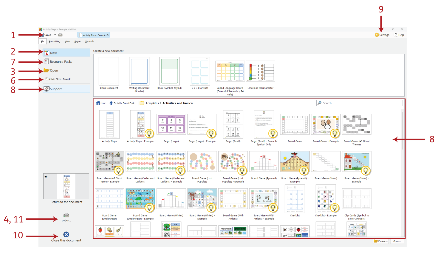
When you start the program, you will be presented with the Launcher screen. The launcher can also be accessed at anytime be clicking on the File tab.
The File tab contains a number of options you can select by clicking the buttons around the edge of the screen.
A dynamic panel (12) in the centre of the screen will display further options after you've clicked a button.
From the File tab/Launcher you can:
-
Close the application
Saving and Loading
Create a New Document
| To create a new, blank document, click the New button on the File tab. |
| You can also create a new document using one of the wide variety of templates included with InPrint 4. Click the Templates button on the File tab to view, open and edit any of the ready-made templates. |
Opening Documents
 |
To open an existing document, click the Open button on the File tab. From here you can navigate to the file that you want to open. The default path for opening InPrint 4 documents is: C:\Users\%username%\Documents\Widgit InPrint 4\InPrint Note: %username% is a variable that Windows will substitute. |
 |
Your most recently opened documents are listed in the Recentsection on the File tab. |
Saving Documents
 |
You can save your document at any time by clicking on the File tab and choosing one of the 'Save' options. The default path for saving InPrint 4 documents is: \\C:\Users\%username%\Documents\Widgit InPrint 4\InPrint Note: %username% is a variable that Windows will substitute. |
 |
Once your document is saved, clicking save again will save over your file. If you want to make a separate copy of your document with a different name, select Save As > Save Document as. |
Saving Templates
 |
In InPrint 4, you can save your documents as templates. |
Templatesare a big time-saver when resources you are creating on a daily basis have the same structure and format. A template is something you create once but can use over and over again.
The default path for saving InPrint 4 templates is:
-
C:\Users\Public\Documents\Widgit InPrint 4\InPrint\Templates
Once your template is saved, you can open it from the Templates section on the File tab.
Auto Save
You can choose to enable auto save for your documents. With auto save enabled, if the program closes unexpectedly or your computer shuts down, you can recover your work when you next open InPrint 4.
A red bar will appear at the top of the File tab where you can choose to Recover your work or Delete any temporary files.

> Enabling Auto Save
To configure your auto save settings, click the File tab, then click Settings, then click on the System tab in the window that appears. Here, you can enable or disable auto save as well as choosing how often the current document is saved.
Recent Files
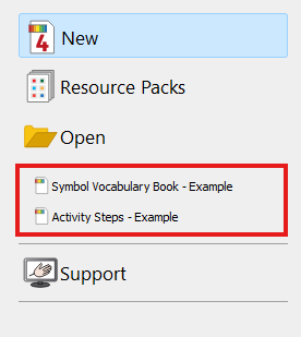
InPrint 4 features a list of recently used files and folders that enables you to quickly find and open documents that were recently closed.
To access recently closed documents, click on the File tab. The 3 most recently opened files are shown immediately beneath the Recent button. Click the Recent button to see a list of up to 30 recent documents in the dynamic panel that appears, as well as the mostly recently accessed folders. Clicking on any of the files will open them for editing within InPrint 4. Clicking on any of the folders will open them so that you can select a file.
To clear the list of recently used files:
1.) Click the Settings button on the File tab.
2.) Select the System tab and click the Clear Recent button in the Recent Lists section.
Opening InPrint 2 files

InPrint 4 will open any of your old InPrint 2 documents (.cip files) and give you the option to save them in the latest file format (.ipdoc).
To open an existing document, select the Open option in the File tab. From here you can choose to open .ipdoc files or .cip files. Double clicking on a .cip file will import your old resource into InPrint 4 and allow you to edit it as you would any other file.
You can also open .ipdoc files or .cip files by dragging them into InPrint 4 from Windows Explorer.
Clicking Save As on the File tab will give you the option to save the document as a .ipdoc file.
Opening InPrint 2 Resource Packs
InPrint 4 will open any of your InPrint 2 resource packs.
To access your resources, click Resource Packs on the File tab. To view the InPrint 2 resource packs installed on your machine, click the View Legacy Resources button at the bottom of the screen.
Double-clicking on a .cip file will import your old resource into InPrint 4 and allow you to edit it as you would any other file.
Click Save As on the File tab to save the document as an .ip4doc (InPrint 4 file). Please note that you cannot open .ipdoc files in InPrint 2.
If you have any problems opening your InPrint 2 files, please contact technical support:
T: 01926 333686
E: [email protected]
Templates

InPrint 4 comes with a wide variety of ready-made templates that you can use as starting points for your resources. Templates are a big time-saver when resources you are creating on a daily basis have the same structure and format.
Opening Templates
To access the templates, click the File tab, then the templates will be available in the middle of the screen. You will be shown a number of folders, sorted by topic, containing ready-made templates. Double-click to open the template of your choice.
Using Templates
After opening a ready-made template, you can edit the content and appearance as you would with any other file.
A template is basically the same as any other document, but objects on the first page of a template are copied to every new page that's created in the document. This can be useful if you want to use the same layout across multiple pages.
If you do not want to use the same layout on a new page then you can edit or remove the template content on that page without affecting other pages in the document.
For each template there is a corresponding example Resource File that will show you how the filled-in template might look.
Saving Templates
 |
In InPrint 4, you have the option to save your documents as templates. If you need to create resources with the same layout over and over again, you can use a template to save time. |
Simply create the resource with the layout that you require, click on the File tab, then click the Save drop down Save As → Save Template As.
The default path for saving InPrint 4 templates is:
C:\Users\Public\Documents\Widgit InPrint 4\InPrint\Templates
Once your template is saved, you can open it from the Templates section of the File tab.
Remember: It's the first page of your file that will be the template page. This is copied to all new pages that are created.
Get More Templates
You can download more templates from the Widgit website. To access more templates, click Templates on the File tab, then click the Get More Templates button at the bottom of the screen.
Resource Packs

Widgit produce a wide range of symbol-supported learning materials and symbol stories, including extensive topic-based packs 'ready to go' for special and mainstream education, healthcare and home use. InPrint 4 comes with a number of pre-installed resource packs that you can print out or customise.
Opening Resource Packs
 |
To access the resource packs, open the File tab and click the Resource Packs button. You will then be shown a number of folders containing ready-made resource packs. Double-click to open the resource pack of your choice. |
Using Resource Packs
After opening a file from a resource pack, you can choose to print it out or edit the content and appearance as you would with any other file.
For many of the example resources there is a corresponding template that you can use to make resources with a similar layout.
Note: Some resource packs downloaded from the Widgit website may include a new Topic Wordlist. Topic wordlists give access to specific vocabulary for a new topic. You can load these wordlists into new documents to have access to the same vocabulary.
Get More Resource Packs
You can download a wide variety of ready-made resource packs from the Widgit website.
To access more resource packs, click the File tab, click the Resource Packs button on the left, then click the Get More Resources button at the bottom of the screen.
Settings
The Application Settings dialog can be used to customise the basic features of InPrint 4.
To access the application settings dialog, click the File tab, then click the Settings button.
The application settings are divided into 4 tabs:
Documents
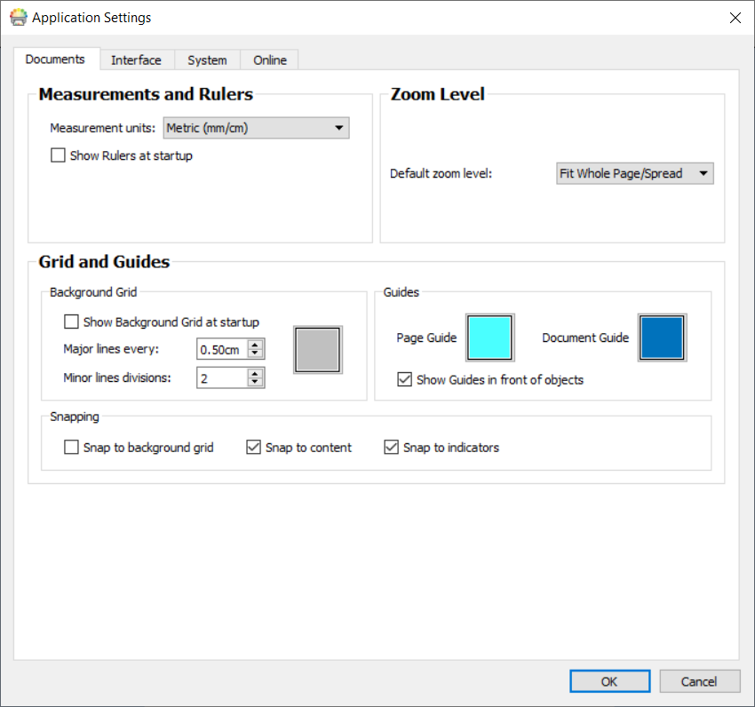
On the Documents tab, you can adjust settings for:
-
Measurements and Rulers. Choose between Metric (mm/cm), Metric (mm only) and Imperial (Inches) units.
You can also enable or disable rulers from being visible when the program opens. -
Zoom level. Choose the default zoom level – Fit to page, fit to width or 100%
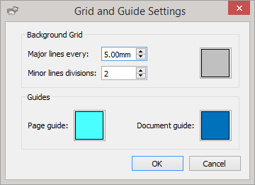
-
Grids and Guides. Enable or disable the background grid and configure the appearance and frequency of its lines.
You can also choose the colour of your page and document guides. Snapping to the background grid and snapping to content can also be enabled or disabled in this section.
Interface
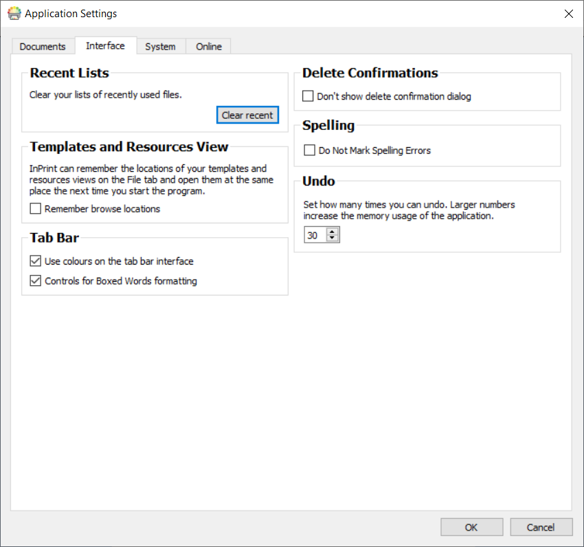
On the Interface tab, you can adjust settings for:
-
Recent Lists. Clear your lists of recently used files.
-
Delete Confirmations. Choose whether or not to show the confirmation dialog when deleting items.
-
Spelling. Choose whether or not spelling errors are marked as you type.
-
Template and Resources View. Remember your location on the File tab between sessions.
-
Undo. Set how many times you can undo. Note: Larger numbers increase the memory usage of the application.
-
Tab Bar. Choose whether to show the rainbow colours on the toolbar and the ‘Boxed words’ formatting controls.
System
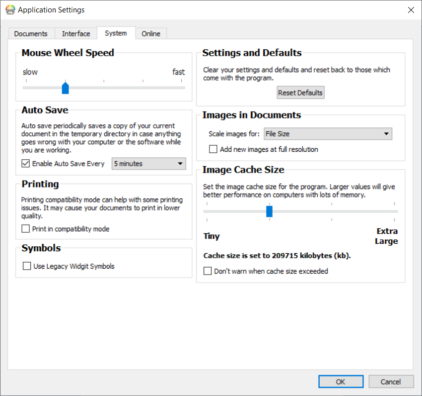
On the System tab, you can adjust settings for:
-
Mouse Wheel Speed. Set the speed of the mouse wheel from slow to fast.
-
Settings and Defaults. Reset the program to its default settings.
-
Auto Save. Toggle the Auto Save feature on or off. If you want to use the auto save feature, you can select how often your work is backed up using the drop-down menu.
-
Images in Documents. Choose whether to scale images for File size or Quality. Set ‘Filesize’ to save smaller documents, of if the application is running slowly.
-
Image Cache Size. Set the image cache size for the program.
-
Printing. Choose to print in compatibility mode. This can help with some printing issues.
-
Symbols. Use legacy symbols (More on Legacy Symbols)
Online
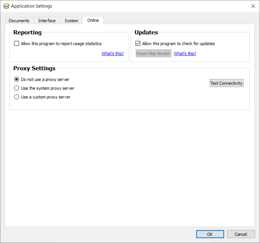
On the Online tab, you can adjust settings for:
-
Reporting. Choose to allow the program to report usage statistics. This will permit InPrint 4 to report anonymous information back to Widgit Software on commonly used features and functions and allow us to improve the software over time.
-
Updates. Choose whether to allow the program to check for new versions.
-
Proxy Settings. If your network uses a proxy server then you can enter the details here. Doing so will give you access to automatic updates and notifications of new versions.
Support and Training

To help get you up and running with InPrint 4, there are a variety of support and training materials that you can access from the File tab.
Click the Support and Training button on the File tab to view the content in the dynamic panel. The content that appears in this panel will vary depending on whether or not you are connected to the Internet.
If you are connected to the Internet then you will see a live webpage with links to videos, help sheets, online training sessions, FAQs, updates and much more.
If you are not connected to the Internet then you will see a static page with links to some basic support materials and information on how to contact Widgit Support.
Updates
The latest version of InPrint 4 will always be available to download from our website.
InPrint 4 will automatically check for updates every time it is launched. When a major update has been released, a red bar will be displayed along the top of the launcher screen, giving you the option to download.
It is recommended that you update whenever you have the opportunity. In addition to improving the software, updates always include the latest version of the Widgit Symbols - ensuring that you have the largest and most up-to-date vocabulary.
Trial Versions
If you would like to try InPrint 4, you can install a 21-day trial version of the program. The trial version has all the same features as the purchased version, and you can request a trial key during the installation process.
The status of your trial will be displayed every time you open the program. A red notification bar along the top of the launcher screen will show you how many days remain of your trial, it will also give you the option to activate with a full serial key if you have purchased the program.

Interface Overview
-
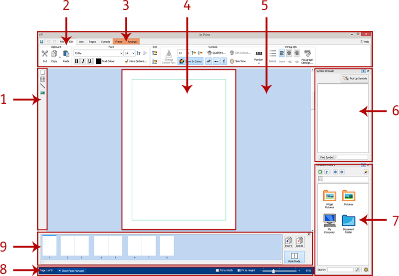
Create - For creating frames, tables, lines and images
-
Tab Bar- These tabs contain all the editing controls
-
Dynamic Tabs- Different dynamic tabs appear, depending on what type of object you have selected
-
Page Spread- This is the current page. You can scroll up and down to navigate through pages
-
Scratch Area- Each Page Spread has its own area that is non-printable where you can place objects whilst working.
-
Symbol Chooser- For picking the appropriate symbols for text
-
Image Library- For adding your own images to the document
-
Page Status Bar- For accessing the Page Manager, zoom, and object measurements
-
Page Manager- For reordering, adding and deleting pages
The Tab Bar
The tab bar runs along the top of the screen. Each tab contains controls for different features of the program. There are two types of tab:
-
Static tabs are always available
-
Dynamic Tabs only appear when certain objects are selected.
Dynamic tabs have a coloured background.
List of Tabs
Static Tabs
File - Saving, loading, and printing. You can also access Templates, Recent files, Resource Packs, Support and Training and Return to or Close the document

Formatting - Change the appearance of symbol and text content 
View- Snapping, zooming and showing rulers, guides and grids 
Pages- Add and delete pages, set up your document and add a document Header and Footer 
Symbols- Choose wordlists, languages and check the spelling of the document 
Dynamic Tabs
Frame (when a frame is selected) - Frame appearance controls 
Speech Bubbles (when a Speech Bubble is selected) - Speech Bubble appearance controls 
Table (when a table is selected) - Controls rows, columns, spacing and merging cells 
Cells (when a table is selected) - Cell appearance controls 
Line (when a line is selected) - Line appearance and measurement controls 
Image (when an image is selected) - Flip, rotate, aspect ratio, edit colours and border appearance 
Image Frame (when an image in a frame is selected) - Flip, rotate, clear image, edit colours and border appearance 
Image Cell (when a table cell containing an image is selected) - Flip, rotate, clear image, edit colours and border appearance 
Arrange (when any object is selected) - Order, align, distribute and group objects 
Header and Footer (when working in Header and Footer mode) - Page numbers and header and footer settings 
Hide/Show Tab Controls
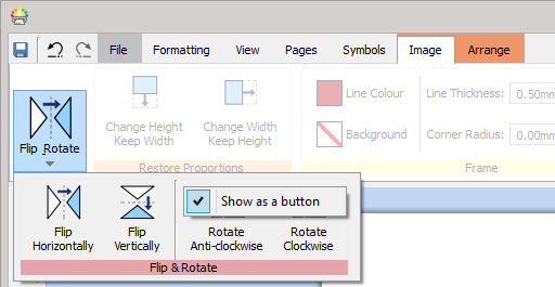
You can hide and show any controls on a tab by collapsing different sections into a button. This can be useful if you are working on a small monitor or in a low resolution.
To Hide a control section, right-click on the Title and select Show as a button.

When a section is collapsed, pressing the button will show a pop out for the available controls.

To Show a section, right-click on the Title in the pop out and uncheck Show as a button.
Page Spreads
Each document is made up of a series of Page Spreads. These contain one or two pages depending if you are in Book Mode or Single Page Mode.
Scratch Area
|
Each spread has its own Scratch Area, the grey area that surrounds the page(s). You can use the scratch area as a place to put objects you don't currently want on any page. Items in the scratch area will not be printed. |
Moving items
You can move objects anywhere on the current Page Spread, but you cannot drag them over the Page Boundary.
If you want to move an object from one page to another, you can Cut (Ctrl+X) it from the first page and then Paste (Ctrl+V) it onto the other.
Keyboard Shortcuts
File Commands
| Save Document | Ctrl + S |
| New | Ctrl + N |
| New from template | Ctrl +T |
| Close | Ctrl + W |
| Open | Ctrl + O |
Print Commands
| Ctrl + P | |
| Export | Ctrl + P |
Edit Commands
| Cut | Ctrl + X |
| Copy | Ctrl + C |
| Copy as Image | Ctrl + Alt + C |
| Paste | Ctrl + V |
| Paste in Place | Ctrl + Shift + V |
| Group | Ctrl + G |
| Ungroup | Ctrl + Shift + G |
| Undo | Ctrl + Z |
| Redo | Ctrl + Y |
| Resize Keeping Aspect Ratio | Shift + resize drag |
| Resize Keeping Centre Fixed | Ctrl + resize drag |
Formatting
| Format Painter | Ctrl + Shift + C |
| Paste just contents formatting | Alt + mouse click |
| Paste just object formatting | Shift + mouse click |
Text Commands
| Bold | Ctrl + B |
| Italic | Ctrl + I |
| Underline | Ctrl + U |
| Align Left | Ctrl + L |
| Align Centre | Ctrl + E |
| Align Right | Ctrl + R |
Symbol Commands
| Cycle Available Symbols | F9 |
| Turn Symbol Off | Shift + F9 |
| Toggle Symbols, Text and Symbols Only Modes | F10 |
| Change Symbol Text | F11 |
Select Commands
| Select Page | Ctrl + A |
| Select All Text | Ctrl + A (in a frame or cell) |
| Select Below / Above | Alt + mouse click |
| Select Next on Page | Alt + Left arrow key |
| Select Previos on page | Alt + Right arrow key |
| Select Multiple Cells | Ctrl + mouse click |
| Deselect Multiple Cells | Ctrl + mouse click |
| Select Multiple Objects | Ctrl or Shift + mouse click |
| Deselect Multiple Objects | Ctrl or Shift + mouse click |
Move Commands
| Small Nudge | Arrow keys |
| Lare Nudge | Shift + Arrow keys |
Page Manager Commands
| Select Multiple Pages | Ctrl + mouse click |
| Select Contiguous Pages | Shift + mouse click |
Arrange Commands
| Send to the Back | Ctrl + Shift + [ |
| Send Backwards | Ctrl + [ |
| Bring to the Front | Ctrl + Shift + ] |
| Bring Forwards | Ctrl + ] |
View Commands
| Zoom In | Ctrl + Numpad+ |
| Zoom Out | Ctrl + Numpad- |
Tools
| Check Spelling | F7 |
| Online Help | F1 |
Creating Objects
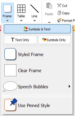
You can create objects using the buttons on the Create toolbar on the left side of the screen. Each of these buttons has a fly out menu with more options. You can create:
 |
Frames - More on creating frames |
 |
Tables - More on creating tables |
 |
Lines - More on creating lines |
 |
Images - More on creating images |
Frame and Table Symbol Modes
When you create a frame or a table, you can decide whether it will be created in Symbol and Text, Text Only or Symbols Only mode.
Symbol Modes
When you create a frame or a table, you can set which Symbol Mode it is set to.
|
Symbol and Text mode |
|
Text Only mode |
|
Symbols Only mode |
The default size for objects created in Symbol and Text mode is taller than Text Only objects. They are both the same default width. You can change the size of an object once it has been created.
Symbol and Text Frame 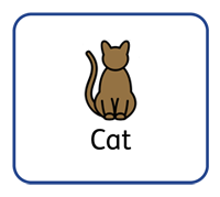 |
Text Only Frame 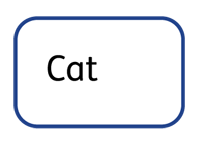 |
Symbols Only Mode 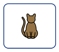 |
Changing Symbol Modes
You can change the symbol mode of a frame or table by using the buttons on the Frame or Cells tab, depending on what you have selected.
|
The Symbol and Text button will change mode and automatically add symbols to any text in the frame or cell. |
|
The Text Only button will change mode and hide all the symbols with any text in the frame or cell. |
|
The Symbols Only button will change mode and hide all of the text within the frame or cell, leaving only the symbol. When you click on a Symbols Only frame, the text associated with the symbol will be displayed in grey, reducing the size of the symbol to fit. Clicking away from a Symbols Only frame will hide the text, the size of the symbol will then increase to fill the frame or cell. Changing to Symbols Only mode will keep any text changes you have made, so if you change mode later the same text will appear. |
|
Replace with Image opens a dialog that allows you to fill the selected object with an image. Please note that when you do this, any previous content in the object will be removed. |
When you change the mode of a frame or table, its size may change, depending on the Sizing Type the object is set to. More on Sizing Types
Sizing Types
The Sizing Type of a frame or table affects the way the size of the content and object change as you add content.
|
Contents Fills Frame |
If the object is made smaller or larger then the content will resize to always be as big as possible.
|
Content Shrinks |
If the object is made smaller then the content will shrink to fit. If the object is made larger then the content will get bigger, but only to the specified size.
|
Frame Grows with Content |
Please note: This mode is not available for table cells.
|
Frame is Fixed |
If the frame or cell is made smaller than the content, the content will overflow. When a frame has too much content, it will be indicated by the Overflow Warning indicator. To see all the content, the object should be made bigger, or the sizing type changed. |
|
Default Sizing Types
|
Clear and Styled Frames |
|
Flashcard Tables |
You can use Tidy Sizes on the Edit tab if you want all the content to be the same size.
|
Thin line Tables |
Clipboard Actions
You can control the clipboard from the Formatting tab.
Basic Actions
|
Cut or Ctrl + X copies the selected object or content to your clipboard and then removes the original |
|
Copy or Ctrl + C copies the selected object or content to your clipboard |
|
Paste or Ctrl + V places the copied object or content into your document |
Copy Symbols into Other Programs
|
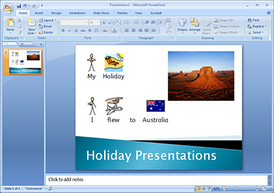
You can copy content from InPrint and paste it into other programs, such as Microsoft Word or PowerPoint. Select the frame or table then press Ctrl + Alt + C or click the Copy as Image button. The Copy as Image button is available on the Copy drop-down menu on the Formatting tab. |
Paste in Place
|
When you do a basic paste, the copied object will be attached to your mouse pointer for you to place wherever you want on the page. You may want to paste something from one page to another but keep the object in exactly the same place for a consistent layout. Do do this, press Ctrl + Shift + V or click the Paste in Place button available on the Paste drop-down menu on the Formatting tab. |
Note: you can also Duplicate whole pages from the Page Manager .
Frames
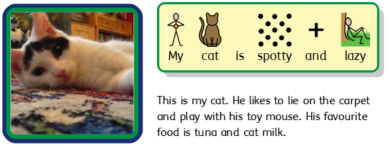
Frames are containers that can be placed anywhere on a page, they can contain:
-
Symbols and Text content
-
Text Only Content
-
Symbol Only Content
-
Images
Frames can be clear, so their content appears without a border or background, or they can be styled in a number of ways. You can also create 'Speech Bubble' frames.
Creating Frames

To create a frame:
|
Click the Frame button on the Create toolbar on the left of the screen. |
|
Select the content mode, choosing from Symbols and Text, Text Only or Symbols Only. |
|
Select the type of frame, choosing from Styled Frame, Clear Frame or Speech Bubble . You can also create a frame with your Pinned Style. Note: You can change the appearance of the frame later. |
When you have selected which type of frame to create, a preview of the frame will be attached to your mouse pointer so that you can see exactly where it will be when you place it in your document. |
|
When the frame has been placed, you can move it by clicking on any edge of the frame and dragging, and you can resize it with the sizing handles. |
|
When creating, moving or resizing a frame, if you have Snappingturned on, your frame will snap to line up with other items or the page boundary. Snapping points are indicated with pale grey lines.
Once you have created your frame, you can click in the frame to start typing.
|
You can also add an image to the frame with the Replace with Image button on the Frames tab. |
Speech Bubbles
To create a speech bubble, click the Frame button in the Create toolbar on the left of the screen to open the Speech Bubble menu. Here, you can choose from:
-
Three types of Speech Bubble
-
Three types of Thought Bubble
-
Three types of Action Bubble
You can also set the Corner Direction for the bubble.
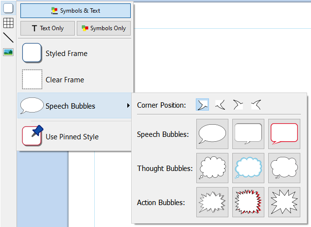
When you have selected the speech bubble you require, you can place it in your document.
Selecting, moving, resizing and measurement controls all work in the same way as regular frames.
Styling Speech Bubbles
When you have placed your speech bubble, you can change its appearance.
|
Change the type of bubble and direction from the Bubble Options button on the Speech Bubble tab. You can also change the Line Colour and Background Colour of the bubble. |

Frame Selection
Selecting a frame to write
|
To select a frame and start writing in it, click anywhere in the frame. When the frame is selected for writing, you will see a dashed line around it and a text cursor will appear in the frame. |
Selecting a frame to move
To select a frame to move or resize it, right-click anywhere in the frame and choose Select Frame from the context menu.
If the frame is currently selected for writing, you can select it for moving by clicking on the edge of the frame.
When the frame is selected for moving or resizing, you will see a solid line around it and 'handles' will appear that you can use to control moving and resizing the frame.
|
|
Selecting multiple frames
To select multiple frames you can either click and drag around the frames, or click on the frames while holding down the Ctrl key.
|
|
You can change the properties of all the selected frames at the same time. This can be really useful for:
-
setting the frame styling
-
changing font style and size
-
changing the symbol colour mode and skin tone
-
arranging the frames
If you want to resize the selected frames as if they were one object then you can group them. More on grouping
Selecting all frames on all pages
|
You can select all of the frames in the entire document at the same time. This can be particularly useful if you want to change the styling properties of every frame all at once. From the Page Status Bar at the bottom of the screen, click Select then Select Frames. Note: When you select objects over multiple pages, you cannot move or resize them. |
Frame Moving and Resizing
Moving a Frame
|
Select the frame(s) you want to move, then click and drag them by the edge of the frame between the resizing handles. You can nudge a selected frame to move it a small amount by pressing the arrow keys on your keyboard. |
Moving a Frame to a precise location
|
To move a frame to a precise location:
Note: You can also open the Measurement and Locking dialog by clicking 'Measurement…' on the 'Frame' tab. |
Moving a Frame between pages
|
You cannot drag a frame from one page spread to another. To move a frame, select it and use the toolbar buttons on the Edit tab or shortcut keys to cut the frame (Ctrl+X) and paste (Ctrl+V) it onto the desired page. |
Resizing a Frame
|
You can resize a selected frame by dragging the resizing handles at the edges of the frame. If snappingis on, the frame will 'snap' to align itself with other objects as it is resized. If you want to resize multiple frames as if they were one object then you can groupthem. |
How the content of a frame behaves when a frame is resized will depend on the frame's sizing type.
Fit to Frame Contents
|
You can resize a frame to fit to its contents by selecting Fit to Content on the Frame tab. This will size the frame up or down accordingly to fit precisely around the text and symbols. |
Making a Frame a precise size
|
You can set a frame to be an exact size by selecting the frame and specifying the Width and Height on the Frame tab. |
Rotating a Frame
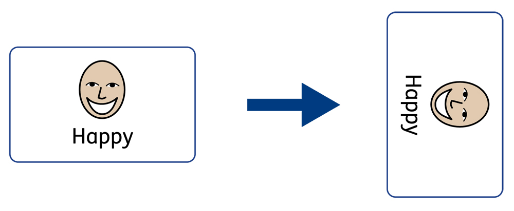
Frames can be rotated both clockwise and anti-clockwise using the Rotate buttons located on the Frame tab.
To rotate a frame:
-
Select the frame.
-
Click on the rotate button of your choice from the frame tab.
-
Each click of the rotate button will rotate the selected frame 90º clockwise or anti clockwise depending on the button you use.
 |
Rotate Anti-clockwise |
 |
Rotate Clockwise |
The text and symbol content of the frame can be edited as normal after rotation.
Frame Styling
You can edit the properties and appearance of the selected frame(s) on the Frame tab.

Colours
|
Click the Line Colour or Background Colour buttons to choose an alternative line colour from a basic colour palette. If you click the More Colours option then you can select a custom colour. |

Line Thickness
To change the line thickness, either type in the box or click in the box once and click the up and down arrows. Line thickness is set in mm. A line thickness of 0mm will hide the line completely.

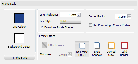
You can set the line to be drawn Inside or Outside the frame boundaries. To change this setting, click the More Options  button in the Styling section of the Frame tab to open the Frame Style dialog. On the Frame Style dialog, select Draw Line Inside Frame.
Corner Radius
To change the corner radius of a frame, type in the box, click the up and down arrows or click in the box and press the up and down keys on your keyboard. Corner radius is set in mm. A corner radius of 0mm will mean that the frame has square corners.

You can also set the corner radius as a Percentage.
To set the corner radius as a percentage, click the More Options  button in the Styling section of the Frame tab to open the Frame Style dialog. Tick Use Percentage Corner Radius.
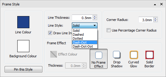
Line Style
To change the appearance of the frame line style, click the More Options  button in the Styling section of the Frame tab to open the Frame Style dialog.
There are 5 line styles to choose from.
-
Solid Line
-
Dashed Line
-
Dotted Line
-
Dot-Dash Line
-
Dot-Dot-Dash Line

Drop Shadow and Effects
|
You can add a drop shadow and various other effects to a frame. To add a drop shadow, click the Drop Shadow button. |
To change the appearance of the drop shadow or to access different effects, click the More Options  button at the bottom of the Styling section of the Frame tab to open the Frame Style dialog.

Choosing Frame Effects
In the Frame Effect section of the Frame Style dialog, you can choose from:
Drop Shadow 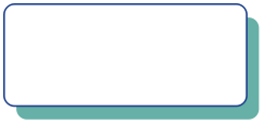 |
Curved Glow  |
Solid Border 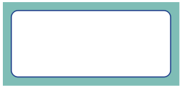 |
For each of these, you can set the effect:
-
Colour
-
Colour transparency
-
Thickness
To set the transparency of a drop shadow, curved or solid border, click the Effect Colour button to open the colour palette and adjust the transparency slider on the right of the palette.
Format Painter
When you have styled your frame you can use the Format Painter to copy formatting from one frame to many others.
|
To do this, select the frame you wish to copy, select the Format Painter from the Formatting Tab, then left click on other frames to paste the formatting. |
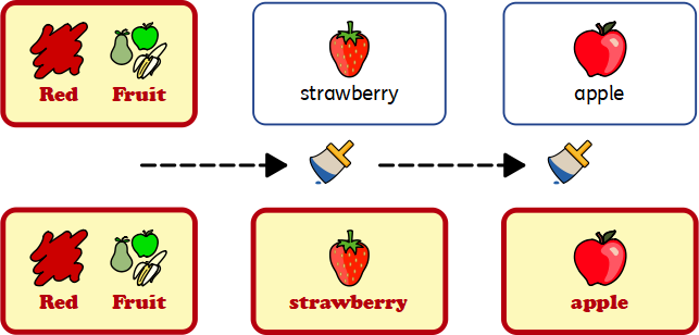
Pinned Styles

|
When you have styled your frame, you can 'pin' its style so that you can create more frames with the same style. To do this, right-click on the frame and select Pin this Style. To create a new frame using the pinned style, select Use Pinned Style from the new frame drop-down on the Create toolbar. InPrint 4 will remember the frame style that you have pinned until you pin a new one, even if the program is restarted. |
Frame Margins and Alignment
You can change the position of text and symbol content in a frame from the Margins and Alignment options on the Frame tab.
Alignment
Use the alignment buttons to set where the content is positioned within a frame:
|
|
Margins
You can change the frame margins to set how far the content is positioned away from the edge of the frame.
|
Use the Increase Margins button to make the margins bigger. |
|
Use the Decrease Margins button to make the margins smaller. |
|
You can set specific margins by clicking the More Options From here, you can set specific margins in mm, and set whether the frame has uniform margins, or different values for the top, bottom, left and right. |
Frame Size and Locking
NOTE: The way a frame behaves when it has content added or resized depends on the Sizing Type of the frame. This can be set from the Frame tab. |
|
Setting the Size of a Frame
|
You can change the size of a frame by dragging the resizing handles. You can also set the Width and Height to precise measurements by typing into the boxes, clicking the up and down arrows or pressing the up and down keys on your keyboard. |
Click on Measurement… for more options. From this dialog, you can:
|
|
Related Sizes
You can set whether the Width and Height are linked or not. If the width and height are linked then the object will keep its original aspect ratio.
|
Width and height linked |
|
Width and height not linked |
Locking
|
Locking Size and Position means that you cannot resize or move the frame. You can still edit the content and change the styling. |
|
Locking Contents means that you cannot edit the content and styling. You can still move and resize the frame. |
You can also lock items from the Arrange tab.
A frame that is locked will show one of the lock indicators when selected.
Tables

You can use tables in your InPrint 4 documents to help with the layout of your content.
Flashcards, labels, vocabulary grids, timetables, name badges, word searches, communication boards and much more can be created by adding a table from the Create toolbar.
Your table's appearance and size can be altered at any time using the Table Layout and Cells tabs.
Creating Tables

To create a table:
|
Click the Table icon in the Create toolbar to the left of the screen. |
|
Select the content mode, choosing from Symbols and Text, Text Only or Symbols Only. |
|
Select the type of table, choosing from Flashcards or Table. You can also create a table with your Pinned Style . |
Note: You can edit either type of table later if you want to change its appearance or add or delete rows and columns. When you select the type of table that you would like to create, the table creator will appear under your mouse pointer. The table creator shows you the number of rows and columns and the total number of cells that will be created. Drag the table creator to the dimensions you require, click once to confirm your choice and create the table. A preview of the table will be attached to your mouse pointer so that you can see exactly where it will be when you place it in your document. |
Left-click on the page to place the table. Right-click to cancel creating the table, you can also press the Esc key on your keyboard to cancel creating the table. |
|
When the table has been placed, you can move it by dragging the edges and resize it with the sizing handles. |
|
When creating, moving or resizing a table, if you have Snappingturned on, your table will snap to line up with other items or the page boundary. Snapping points are indicated with pale grey lines.
Create Table from Frame
|
You can create a table of identical cells. This is particularly useful for creating sticker sheets. Create and style a frame with the desired content. Select Create Table from Frame, then move your mouse until you see the desired number of cells. Then left click to confirm. |

Split Table
|
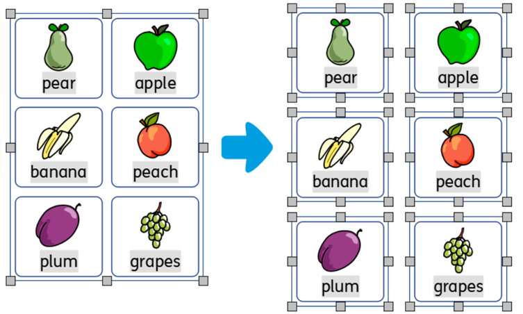
You can break apart the cells in a table to create a collection of frames by selecting Split Table. |
Tab between cells
To quickly fill your table with content, you can tab between cells.
|
You can also add an image to the table cell by clicking the Replace with Image button on the Cells tab. |
Table and Cell Selection
Selecting a cell to write
To select a cell and start writing in it, click anywhere in the cell. When the cell is selected for writing, you will see a dashed line around the table and a text cursor will appear in the cell.
|
|
Selecting a table to move
To select a table to move or resize it, right-click anywhere in the table and choose Select Table from the context menu.
If a cell in the table is currently selected for writing, you can select the table for moving and resizing with the context menu option, or by clicking on the edge of the table.
When the table is selected for moving or resizing, you will see a solid line around it and 'handles' will appear that you can use to control moving and resizing the table.
|
|
Selecting cells
To select a cell in a table:
To select multiple cells:
Or Left click and drag across the table to select multiple cells. |
|
Selecting multiple tables
To select multiple tables you can left-click and drag around the tables, or click on each of the tables whilst holding down the Ctrl key.
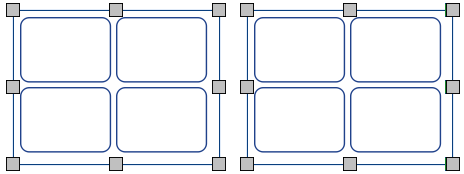
You can change the properties of all the selected tables at the same time. This can be really useful for:
-
setting the table styling
-
changing font style and size mode
-
changing the symbol colour mode and skin tone
-
arranging the tables
If you want to resize the selected tables as if they were one object then you can group them. More on grouping
Selecting all tables on all pages
|
You can select all of the tables in the entire document at the same time. This can be particularly useful if you want to change the styling properties of every table cell all at once. From the Page Status Bar at the bottom of the screen, click Select then Select Tables. Note: When you objects selected over multiple pages, you cannot move or resize them. |
Table Moving
|
To move a table, Select the table(s) that you want to move, then drag them by the edge of the table between the resizing handles. You can nudge a selected table to move it a small amount by pressing the arrow keys on your keyboard. |
Moving a Table to a precise location
|
To move a table to a precise location:
|
Note: You can also open the Measurement and Locking dialog by clicking 'Edit Table Measurements…' on the 'Table Layout' tab or 'Measurement…' on the 'Cells' tab.
Moving a Table between pages
|
You cannot drag a table from one page spread to another. To move a table, select it and use the toolbar buttons on the Formatting tab or shortcut keys to cut the table (Ctrl+X) and paste (Ctrl+V) it onto the desired page. |
Table Size
You can resize tables in different ways:

|
NOTE: The way a table behaves when it has content added or resized depends on the Sizing Type of the cells in the table. This can be set from the Cells tab. Different cells in a table can have different Sizing Types. |
Resizing a Table

You can resize a selected table by dragging the resizing handles at the edges of the table. If Snapping is on, the table will 'snap' to align itself with other objects as it is resized.
If you want to resize multiple tables as if they were one object then you can group them.
How the contents of a table cell behave when the table is resized will depend on the cell's sizing type.
Making a Table a precise size
|
To make a table a precise size:
|
|
Note: You can also open the Measurement and Locking dialog by clicking 'Measurement…' on the 'Cells' tab or by clicking the Measurement and Locking button on the Page Status Bar at the bottom of the screen. |
Advanced Table Measurements
You can use the advanced Table Controls to gain more precise control over the whole table.
Click on the Edit Table Measurements button on the Table Layout tab to open the Measurement and Locking dialog. If only the Basic Controls are displayed, click the Table Controls button to expand the dialog.

Select Change Table Size to edit the whole table. You can see how your changes affect the row, column and cell sizes. You can click in an individual cell to see its measurements.
From this dialog you can also:
-
Lock the table size and position
-
Lock the table contents
-
Position the top left of the table relative to the page.
Row / Column Size
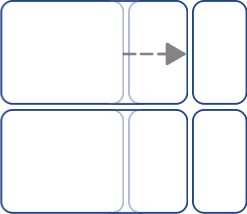
You can resize a row or column by dragging the row/column boundary with your mouse.

Making a Row / Column a Precise Size
You can set an exact size for a row or column by changing the Row Height or Column Width on the Table Layout tab.

Reset Row / Column Sizes
You can reset the row or column sizes to be all the same by selecting Distribute Rows Evenly or Distribute Columns Evenly on the Table Layout tab. |
|
|
Distribute Rows Evenly |
|
Distribute Columns Evenly |
Advanced Row / Column Size
You can use the advanced Table Controls to gain more precise control over the whole table.
Click the Edit Table Measurements button on the Table Layout tab to open the Measurement and Locking dialog. If only the Basic Controls are displayed, click the Table Controls button to expand the dialog.
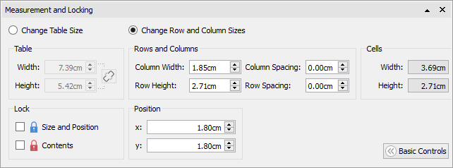
Select Change Row and Column Sizes to edit the rows and columns rather than the table.
-
If you click in a cell on the table, your changes will only affect the row and column that the cell belongs to.
-
If you have the whole table selected, your changes will affect all rows and columns.
Edit the values for Column Width and Row Height. The table will change as you edit, so that you can see how your changes affect the measurements, table and cell sizes.
Note: You can also open the Measurement and Locking dialog by clicking 'Measurement…' on the 'Cells' tab or by clicking the Measurement and Locking button on the Page Status Bar at the bottom of the screen.
Cell Size
You can change the size of individual cells in a table by splitting and merging cells and by creating irregular cells with the cell margins.
Irregular cells
You can change the Cell External Margin to make a cell smaller than other cells.
This can be particularly useful for creating tick and answer boxes.
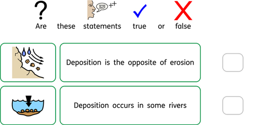
Click on the Irregular Cells button on the Table Layout tab
Select the cell you want to change, or select multiple cells using the Ctrl key.
You can set the specific Cell Size you require, or change the Cell External Margin.
Merging cells
|
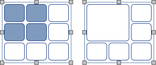
To merge cells, select the cells that you want to combine and click Merge Cells on the Table Layout tab. |
Splitting cells
|
Select the cell you want to change, then click Split Cells on the Table Layout tab. You can choose to: |
|
Split Cells horizontally |
|
Slip Cells vertically |
Add and Remove Rows / Columns
You can add rows and columns to a table. You can remove rows and columns from a table.
Add Rows
|
To add a row to your table, click in a cell on the row next to where you want to add a new row, then click Insert Row on the Table Layout tab. On the sub-menu that appears, you can choose if the new row will appear above or below the current row: |
Remove Rows
|
Select a row by clicking in one of its cells. You can select more than one row by holding the Ctrl key and clicking in a cell on every row that you want to remove. |
Click the Remove Row button on the Table Layout tab. This will remove all rows containing selected cells.
Add Columns
|
To add a column to your table, click in a cell in the column next to where you want to add a new column, then click Insert Column on the Table Layout tab. On the sub-menu that appears, you can choose if the new column will appear on the left or the right of the current column: |
 Add Column Left
 Add Column Right
Remove Column
|
Select a column by clicking in one of its cells. You can select more than one column by holding the Ctrl key and clicking in a cell in every column that you want to remove. |
Click the Remove Column button on the Table Layout tab. This will remove all columns containing selected cells.
Locking Table Size
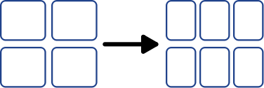
When you add rows and columns to an unlocked table, the table will get bigger. If you want your table to remain the same size when you add rows and columns then you can lock it first.
To lock the size of a table:
-
Select the table.
-
Click the Measurement and Locking button on the Page Status Bar at the bottom of the screen.

-
On the dialog that appears, tick Size and Position.

Unlocked table:

Locked table:
Note: You can also open the Measurement and Locking dialog by clicking 'Edit Table Measurements…' on the 'Table Layout' tab or 'Measurement…' on the 'Cells' tab.
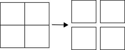
Table Spacing
You can change the amount of space between cells in a table. This can be useful for creating tables containing tabular data or flash cards for cutting out.
Click in a cell, then click the Increase or Decrease buttons on the Table Layout tab to change the spacing for the whole table.
![]()


Row / Column Spacing
You can change the spacing for individual rows and columns from the advanced Table Controls.
Click the Edit Table Measurements button on the Table Layout tab to open the Measurement and Locking dialog. If only the Basic Controls are displayed, click the Table Controls button to expand the dialog.
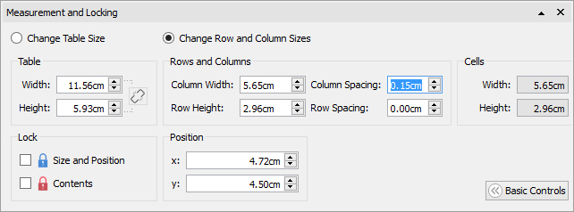
Select Change Row and Column Sizes to edit the rows and columns rather than the whole table.
-
If you click in a cell on the table, your changes will only affect the row and column that the cell belongs to.
-
If you have the whole table selected, your changes will affect all rows and columns.
Edit the values for Column Spacing and Row Spacing. The table will change as you edit, so that you can see how your changes affect the measurements, table and cell sizes.
Cell Margins and Alignment
You can change the position of text and symbol content in table cells with the Margins and Alignment options on the Cells tab.
Alignment
Click the alignment buttons to set where the content is positioned in a table cell:
|
|
Margins
You can change the cell margins to set how far the content is positioned away from the edge of the cell.
|
Use the Decrease Margins button to make the margins smaller. |
|
Use the Increase Margins button to make the margins bigger. |
|
You can set specific margins by clicking the More Options From here you can set specific margins in mm, and set whether the cell has uniform margins or different values for the top, bottom, left and right. |
Rotating a Cell
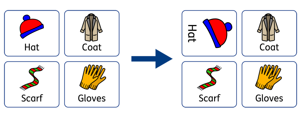
Cells can be rotated both clockwise and anti-clockwise using the Rotate buttons located on the Cells tab.
To rotate a table cell:
-
Select the cell.
-
Click on the rotate button of your choice from the Cells tab.
-
Each click of the rotate button will rotate the selected cell 90º clockwise or anti clockwise depending on the button you use.
 |
Rotate Anti-clockwise |
 |
Rotate Clockwise |
The text and symbol content of the cell can be edited as normal after rotation.
Table and Cell Styling
You can edit the properties of a selected table cell and change its appearance on the Cells tab.

Selecting what to style
You can select different parts of the table:
-
One cell - click in the cell
-
Multiple cells - hold down Ctrl and click in each cell
-
Whole table - click on the table boundaries
-
Multiple tables - hold down Ctrl and click in each table
Colours
|
Click the Line Colour or Background Colour buttons to choose an alternative colour from the basic colour palette. Click the More Colours option to select a custom colour. Drag the transparency sliderto make the colour solid or transparent. More about the Colour Palette. |

Line Thickness
To change the line thickness, type in the box, click the up and down arrows or click in the box and press the up and down keys on your keyboard. Line thickness is set in mm.

You can set the line to be drawn Inside or Outside the cell boundaries. By default, the line is drawn outside the cell boundary. To change this, click the More Options  button in the Styling section of the Cells tab to open the Frame Style dialog. Then tick Draw Line Inside Frame.

Corner Radius
To change the corner radius of a cell, type in the box, click the up and down arrows or click in the box and press the up and down keys on your keyboard. Corner radius is set in mm. A corner radius of 0mm will mean that the cell has square corners.

You can also set the corner radius as a Percentage. You can use this to create a round cell by setting the corner radius to 100%.
To set the corner radius as a percentage, click the More Options  button in the Styling section of the Cells tab to open the Frame Style dialog. Tick Use Percentage Corner Radius.
Line Style
To change the appearance of the table line style, click the More Options  button in the Styling section of the Cells tab to open the Frame Style dialog.
There are 5 Line Styles to choose from.
-
Solid Line
-
Dashed Line
-
Dotted Line
-
Dot-Dash Line
-
Dot-Dot-Dash Line


Drop Shadow and Effects
|
You can add a drop shadow and various other effects to a table cell. To add a drop shadow, click the Drop Shadow button. |
To change the appearance of the drop shadow or access different effects, click the More Options  button in the Styling section of the Cells to open the Frame Style dialog.

Setting Frame effects In the frame effects dialog you can set:
For each of these you can set the effect:
|
|
Format Painter
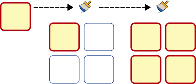
When you have styled your cell you can use the Format Painter to copy formatting from one cell many others.
|
To do this, select the frame you wish to copy, select the Format Painter from the Formatting Tab, then left click on other cells to paste the formatting. |
Change a whole table by clicking on the edge selection points of the table.
Pinned Styles

|
When you have styled your table, you can 'pin' its style so that you can create more tables with the same style. To do this, right-click on the table and select Pin this Style. To create a new table using the pinned style, select Use Pinned Style from the new table drop-down on the Create toolbar. InPrint 4 will remember the table style that you have pinned until you pin a new one, even if the program is restarted. |
Lines
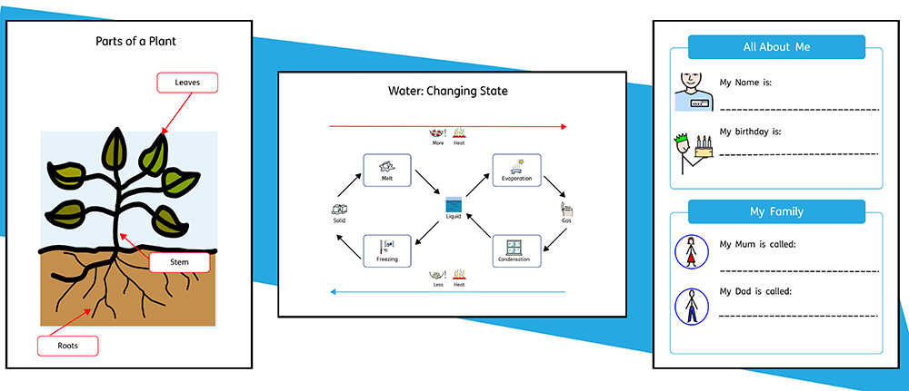 You can add lines and arrows to your work to help create a wide variety of resources. Lines can be used to label diagrams, explain the order and flow of processes, provide space for writing or simply provide decoration for items on your page.
A line's size and appearance can be altered at any time with the options on the Line tab.
Creating a Line
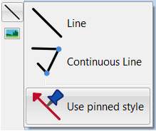
Lines can be created using the Create Toolbar. Clicking the Line button gives you the option to add two types of line to your document.
|
A single Line will be created. |
|
Use Continuous Line to create a line with multiple points. |
You can also create a line with your Pinned style.
Single Line
|
To create a single line, click the Line button on the Object Creation toolbar and select Line from the drop-down. Your cursor will change to a crosshair. Click once on the page to start drawing a line, a dashed line will appear to show you where the line will be drawn. Click again to finish drawing and create the line. You can also click and drag to create a line. |
Continuous Line
To create a line with multiple points, select Continuous Line from the Line drop-down on the Create toolbar. Your cursor will change to a crosshair.
Click once on the page to set the start point, a dashed line will appear to show you where the line will be drawn. Move your mouse to the position for the next point and click to add a new point, creating a starting position for the next section of your line. Repeat these steps as many times as you need to create a continuous line in the style you require. Double-click to finish drawing and create the last section of the line.

Line Appearance
The appearance of single or continuous lines can be altered in a number of ways using the Line tab.

Line Style
There are 5 Line Styles to choose from in the drop-down menu:
 |
Solid Line |
 |
Dashed Line |
 |
Dotted Line |
 |
Dot-Dash Line |
 |
Dot-Dot-Dash Line |
Thickness
To change the line's thickness, type in the box, click the up and down arrows or click in the box and press the up and down keys on your keyboard.

Line Colour
|
Click the Line Colour or Background Colour buttons to choose an alternative colour from the basic colour palette. Click the More Colours option to select a custom colour. Drag the transparency slider to make the line colour solid or transparent. More about the Colour Palette. |
Line Start and End
There are 4 end styles available in the drop-down for the Line Start and Line End:
 |
No Arrow |
 |
Open Arrow |
 |
Solid Arrow |
 |
Circle |
Pinned Styles
|
When you have styled your line, you can 'pin' its style so that you can create more lines with the same style. To do this, right-click on the line and select Pin this Style. To create a new line using the pinned style, select Use Pinned Style from the new line drop-down on the Create toolbar. InPrint 4 will remember the table style that you have pinned until you pin a new one, even if the program is restarted. |
Line Controls and Size
|
You can use the options on the Line tab to make lines a specific length or position them on a specific angle. |
Line Handling
|
You can move a line by dragging from the middle of the line. You can change a line by dragging the handles at the ends of the line. If you have Snap to Content turned on, the handles of the line will snap to other objects, making it easy to create diagrams and flow charts. |
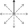
Snap to 45°
 |
 |
If you have Snap to 45° turned on, when you move the handles of a line, the line will snap to all the 45° points. |
Length
|
You can change the length of a line manually by selecting and dragging it to a larger or smaller size. You can also use the Length box on the Line tab. Click on the line to select it, then type in the Length box, click the up and down arrows or click in the box and press the up and down keys on your keyboard. Line length is specified in cm/mm. |
Angle From Vertical
|
You can change the angle of a line manually by selecting and dragging one of the handles to a different position. You can also use the Angle from Vertical box in the Line tab to change the angle. Click on the line to select it, then click the up and down arrows in the Angle from Vertical box to increase or decrease the angle of your line from vertical. Alternatively you can type the angle value directly into the box. |
Locking
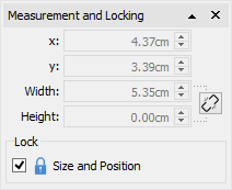  |
 |
You can lock the size and position of a line by clicking the Measurement and Locking button on the Page Status Bar at the bottom of the screen. |
Selecting all lines on all pages
|
You can select all of the lines in the entire document. This can be particularly useful for changing the appearance of all lines at once. On the Page Status Bar at the bottom of the screen, click Select then Select Lines. Note: When you select objects over multiple pages, you cannot move or resize them, only change their appearance. |
Images
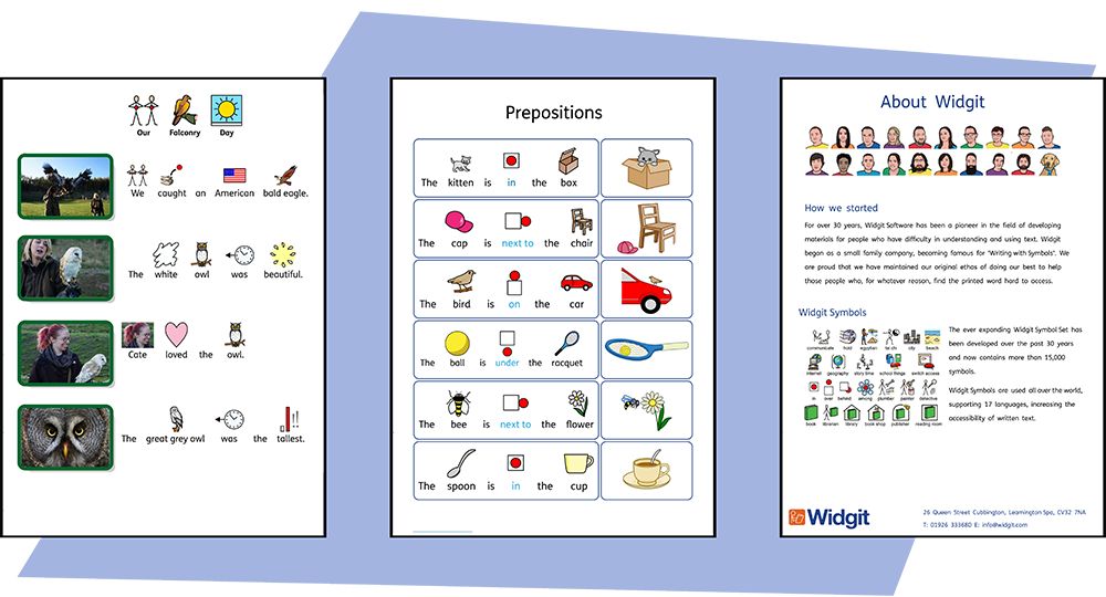
You can add Images to your InPrint 4 documents from a number of sources, using them to replace symbols or as paragraph graphics.
From the Create toolbar, you can add images from your My Pictures folder, Browse for Pictures saved elsewhere on your computer or choose from over 4000 Widgit Media files which come pre-installed with InPrint 4.
You can also copy images from the web and paste them directly into your documents.
Adding Images
You can add images to your document from a range of sources.
You can add images straight onto the page, or into a Frame or Table Cell.

Adding a Widgit Media Image
Widgit Media is a large collection of graphics, included with InPrint 4. They cover a wide range of subjects and can be used for building up scenes and decorating pages.
You can access Widgit Media from the Image Library on the right.
When you have found the image you want to use, you can click once to select it and again to drop it onto the page, or click and drag it onto the page.
Adding a Widgit Symbol as an Image
|
As well as writing with symbols, you can add them as graphics to your document. Type the word for a symbol in the box at the bottom of the Symbol Chooser on the right and click Find Symbol. When you have found the symbol you want to use, you can click once to select it and again to drop it onto the page, or click and drag it onto the page. You can also add a Widgit Symbol without displaying text underneath using Symbols Only mode. |
Black and White / Monochrome Symbols
|
All Widgit Symbols can be displayed in colour or monochrome (where you can choose the line colour). Click the Show in Colour button on the symbol chooser to toggle symbol colour on and off. |
Adding Your Own Image
Use the Image Library to browse your computer or network to find your own images.
You can also drag images directly from Windows Explorer into your document.
Adding an Image from a Website
You can add an image from a website to your document.
Right-click on the image in your browser and select Copy Image. Then press Ctrl + V in InPrint to paste the image.
|
|
Image Library
|
The Image Library, on the right of the screen, provides you with quick access to images on your machine or network as well as over 4,000 Widgit Media files. By default, the image library contains links to your personal My Pictures folder, My Computer, and Widgit Media. Files in these folders will be displayed as thumbnails that you can click on to add the image to your document, either as imagesor replacement symbols. |
Navigating the Image Library
|
Clicking on a disk or folder in the image library will display its contents and subfolders as thumbnails. Use the Navigation buttons and address bar at the top of the image library to help you move back and forth through your files and folders. Click the Home button to return to the top level of the library. |
Using an Image from the Image Library
|
When you have found the image you want to use, you can click once to select it and again to drop it onto the page, or click and drag it onto the page. The image will remain attached to your cursor until you put it on the page. You can right-click to cancel your selection. |
Dock and Undock the Image Library
|
By default the Image library is docked underneath the symbol chooser on the right of the program. The on-screen position of the image library can be changed if you click the dock / undock option. When this option is clicked, the image library window will become free-floating, allowing you to drag and position it in an different location. Click the dock / undock option to move the window back to the toolbar or manually drag it back to the bottom right corner to snap it into place. |
Personalising the Image Library
You can add your own shortcuts to the Image Library to make it easier to access your favourite graphics.
Creating shortcuts
|
To create a shortcut to a file or folder, right-click on it in the Image Library and select Add shortcut to library from the context menu. The shortcut will be created at the top level of the Image Library, click the Home button to return to the top level. |
Note: You can create shortcuts to images that you use all the time, like photographs or your organisation's logo.
Favourites
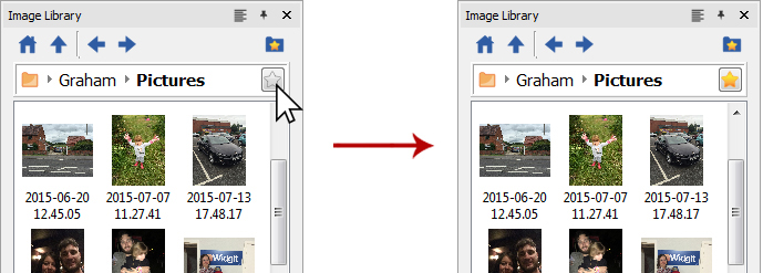
If you have lots of different folders you like to take images from to use in your resources you can set up a list of favourite locations to navigate to at the click of a button.
In the address bar next to the folder path you will notice a grey star, click this to make the selected folder a favourite and turn the star yellow.
|
Your full list of favourites can be viewed by clicking on the Favourites button at the top of the image library. Click on an option in the list to be taken to its corresponding location. Folders can be setup to help you manage and store your favourites. |
Legacy Widgit Pictures

InPrint 4 comes with new graphics you can view through the image library. You can also use the image library to view the old Widgit Pictures graphics which were installed with older versions of InPrint.
To access these select the Show Legacy Widgit Pictures option at the top of the image library. Once selected a shortcut to the Widgit Pictures will be created at the top level of the image library.
Widgit Media

InPrint 4 gives you access to 4000+ Widgit Media graphics as well as over 15,000 Widgit Symbols. These beautifully drawn Widgit Media files cover a wide range of subjects and can be used as illustrations in your resource or combined to build up scenes.
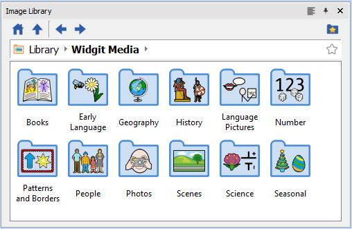
Widgit Media includes images for:
|
|
To access Widgit Media, click on the Widgit Media folder in the Image Library.
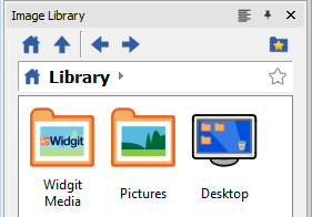
Images in Frames and Table Cells
Images can be added straight onto the page, or into a Frame or Table Cell.

Images added into frames and cells have slightly different properties to regular images.
Dynamic Tabs
Selecting frames or cells containing images open a slightly different dynamic tab to regular images. They are called Image Frame and Image Cells.
![]()
![]()
From these tabs you can access all the controls for both the image and the frame or cell.
Select an Image
|
To select an image located within a frame or cell, simply left click anywhere on it. Once selected the image will be highlighted with a blue box. |
Remove or Change an Image
Once a frame or cell contains an image you cannot add symbol and text content to it.
|
To clear the frame or cell, click the Remove Image button. This will convert the frame or cell back to its original state. You can also click on the image and press delete to clear the frame or cell. |
|
To change the frame or cell, click the Change Image button. This will open a browser for you to navigate to a new image. Alternatively, you can drag another image from the Symbol Chooser or Image Library to replace it. |
Size and Aspect Ratio
Images added to frames and table cells keep their original aspect ratio. This means they cannot be stretched out of proportion.
Image Frame Size
You can change the size of a frame by moving its resizing handles.
You can set the Width and Height to precise measurements by typing into the boxes or clicking the up and down arrows. |
|
Fit to Frame Contents
|
You can resize a frame to fit to its contents by selecting Fit to Content on the Image Frame tab. This will size the frame up or down accordingly to fit precisely around the image. |
Note: To make an image fit exactly into a frame, you may need to change the frame margins to 0.

Image Cell Size
You can change the size of a whole table by moving its resizing handles.
Image Handling
Selecting Images
|
Click on an image to select it. |
Selecting all images on all pages
|
You can select all the images within the entire document. This can be particularly useful for changing the styling properties of all images at once. From the Page Status Bar at the bottom of the screen, click on Select then choose Select Images. Note: When you select objects over multiple pages, you cannot move or resize them. |
Moving an Image
Select the image or multiple frames you wish to move then drag them from the edge of the frame.
You can nudge an image to move it a small amount by pressing the arrow keys.
If snapping is turned on the the image will line up with other objects as it is moved about. More on Snapping
You can line up images with other objects using to options on the Arrange tab.
More on Arranging
Moving an image to a precise place
| To move an image to a precise location, open the Measurement and Locking dialog from the Page Status Bar at the bottom of the screen. From the dialog that appears you can set the X and Y coordinates of the top left corner of the image. |
 |
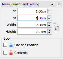 |
Resizing an Image
|
You can resize a selected image by dragging the resizing handles. If snapping is turned on the the image will snap with other objects as it is resized. More on Snapping If you wish to resize the multiples images as one object then you can group them. More on grouping |
Making an Image a precise size
You can set an image to be en exact size by setting the Width and Height on the Image tab. |
|
Restoring Proportions
If an image becomes stretched you can reset its aspect ratio.
Restore the proportions by:
|
Changing the height - keep the width the same. |
|
Changing the width - keep the height the same. |
|
You can also right-click on an image and use the context menu to Restore Aspect Ratio. This always changes the width of the image back to its original. |
Modifying Images
Flipping Images
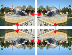
You can flip images both horizontally and vertically using the Flip and Rotate buttons on the Image tab.
|
Flip horizontally - left to right |
|
Flip vertically - top to bottom |
Rotating Images
|
You can rotate images both clockwise and anti-clockwise.
|
Recolouring Images
Widgit Symbols, Widgit Media Images and .svg vector graphics can be recoloured which is very useful if you are trying to customise an image to make it more specific.
|
Select the image you wish to recolour and click the Edit Colours button on the Image tab. A recolour dialog will appear. |
Note: If this button is greyed out then the image format does not support recolouring, such as photographs and other .jpg and .png images.
Click on a colour in the palette to recolour it. You can also click on the image and this will select the appropriate colour.

Pick a new colour from the palette or select More colours to define a new colour.
When you have finished, click OK.
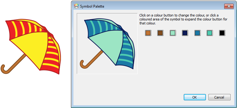
Image Styling
You can change various properties of an image to change its appearance from the Image tab. 
Border Colours
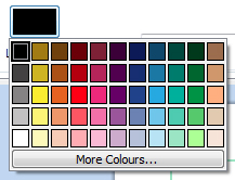 |
Click the Line Colour or Background Colour buttons to choose an alternative line colour from a basic colour palette. If you click the More Colours option you can select a custom colour. Read more about the Colour Palette. | 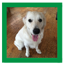 |
Border Line Thickness
To change the line thickness of the border, type in the box, click the up and down arrows or click in the box and press the up and down keys on your keyboard. Line thickness is set in mm.
Corner Radius
To change the corner radius of a image, type in the box, click the up and down arrows or click in the box and press the up and down keys on your keyboard. Corner radius is set in mm. A corner radius of 0mm will mean that the image has square corners.

You can also set the corner radius as a Percentage. You can use this to create a round image by setting the corner radius to 100%.
To set the corner radius as a percentage, click the More Options  button in the Frame section of the Image tab to open the Frame Style dialog. Tick Use Percentage Corner Radius.
Drop Shadow and Effects
|
You can add a drop shadow and various other effects to an Image. |
To add a drop shadow, click the Drop Shadow button. To change the appearance of the drop shadow or access different effects, click the small triangle next to the Drop Shadow button.
Configuring Frame effects
|
In the frame effects dialog you can set:
For each of these you can set the effect:
|

Margins
You can change the margins for an image. This is particuly useful if you have a visible border and would like the image to have some extra space. Select the Margins button on the Image tab to bring up the margins dialog. |
|
Writing Content
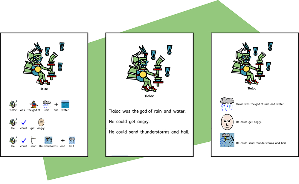 InPrint 4 comes with over 20,000 unique Widgit Symbols to allow you create a wide variety of symbol supported documents. Based on the student you are working with or the type of resource you are creating you can choose to Write in Symbols, write in text and illustrate text with symbols.
Our revolutionary Smart Symboliser system will analyse the text you type to help select the correct symbols while using the Symbol Chooser ensures you are in complete control of how each word is symbolised.
Writing in Symbols

You can write and add symbol content to you resources by creating a frame or table in Symbols and Text mode.
As you type text into these frames your content will automatically be symbolised with symbols appearing above the text.
Our revolutionary Smart Symboliser system will analyse the text you type to help select the correct symbols.
With over 15,000 symbols in the Widgit Symbol Set, more often than not multiple symbols will be available for a certain word. You can choose between these symbols using the Symbol Chooser, which can also be used to turn off symbols for selected words.
Guide to Symbols
|
There are a number of different methods you can use to provide symbol support for your content. The methods that you choose will depend on the level of symbol support that your content requires. These methods are discussed in detail in our Guide to Symbols booklet which offers a useful insight in to supporting text with symbols. Click here to view this booklet: Guide to Symbols.pdf |
Using the Smart Symboliser
When you type in symbols, the ‘smart symboliser’ analyses the parts of speech in the sentences and picks the correct symbol accordingly.
For example if you type “drink your drink”, the symboliser will pick the verb form for the first “drink” and the noun form for the second.

You can change the symbol in the Symbol Chooser.
The Symbol Chooser
The Symbol Chooser displays the available symbols for words and phrases as you type.
You can toggle through the available symbols for the current word by pressing the F9 key. You can also select a symbol by clicking on it in the symbol chooser. To remove the symbol for a word, click the No Symbol icon at the end of the list of available symbols in the symbol chooser.
When you have selected a symbol for a word or phrase, it will be used by default for the current document.

Setting the Default Symbol
You can change which symbol is used for a word of phrase by default for every document you create.
To change the default symbol, click on the Star by your preferred symbol in the Symbol Chooser, or right-click and select Set this as the Default Symbol.
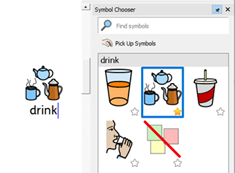
In this example we have changed the default symbol for ‘drink’ to the noun form of drink (a drink). If you type the verb form (to drink), the smart symboliser will still choose the correct symbol showing the action for the verb.
Defaulting a Symbol Off
Not all symbols are necessary, especially for people who are new to symbols. Abstract concepts like ‘a’, ‘the’, ‘if’, ‘but’ and ‘so’ can be removed. For readers unfamiliar with symbols, only the main concepts should be symbolised.
|
Some abstract symbols are already defaulted off. You can set a symbol to not show by setting Symbol Off as the default. |
Changing the Words for a Symbol
You may wish to use an existing symbol, but change the text used below.
Type the words for the symbols you require.

|
Then click the Change Symbol Text Button on the Edit tab or the F11 Key. |
Now type the new word, followed by either the right arrow key or click OK in the process bar at the top of the page.
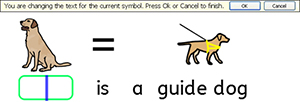

The word “Lyla” is now automatically depicted as a labrador and will continue to be throughout the rest of the document (the symbol for labrador will also remain associated with the word labrador).
To save your vocabulary changes to use in other documents see Saving your Wordlist Changes .
Changing the Image for Word
You can change the image used with a particular word or phrase.
Add a new symbol
|
Search for the symbol in the Symbol Chooser. Select Pick up Symbol, then click on the symbol you require and drop it onto the word. You will see a grey drop indicator showing where the symbol will be placed. When you search for a symbol you can choose if the image is in colour or black & white. Ans also select the desired Skin Tone. |
Add a photo or graphic
|
Navigate to the image you require in the Image Library. Select the image to pick it up, then drop it on the word. You will see a grey drop indicator showing where the image will be placed. |
Add an image from the internet
|
You can drag images from some internet browsers straight from the page they are on, directly into your document. You will see a grey drop indicator showing where the image will be placed. |
Combining Symbols
You can combine multiple symbols together over a single word or phrase. To do this type the symbols you require.
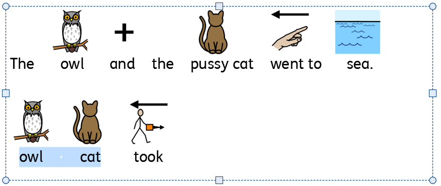
|
Then highlight both words and click the Change Symbol Button on the Edit tab or the F11 Key. |
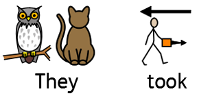
Now type the new word to appear below both symbols, followed by either the right arrow key or click OK in the process bar at the top of the page.
Combining Words
You can combine words under a single symbol or image in two ways.
Settings a Symbol for Selected Text
Type the words you require. Highlight the words you want to change the symbol for and then right-click on the symbol you wish to be displayed for both words. From here select Set this symbol for selected text.
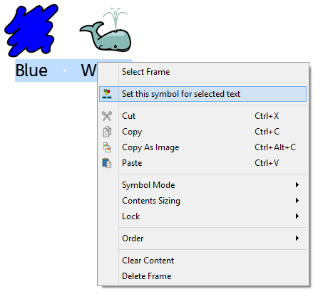
This will change the entire selection to have one symbol - The symbol you selected.

Dropping a Symbol Over Multiple Words
Highlighting more than one word, allows you to add an image onto the entire highlighted selection.
You can add an image from:
-
The Image Library
-
Searching the Symbol Chooser
-
Dragging direct from a web page
You will see a grey drop indicator showing where the image will be placed.
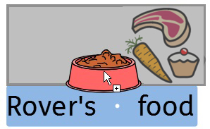
Writing in Text
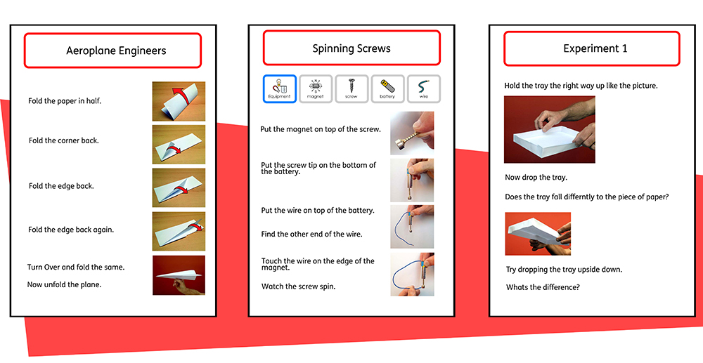
You can choose to write without symbol support by creating a frame or table in Text Only Mode . This can allow users to check the meaning of words after they have been typed by watching what appears in the Symbol Chooser (rather than having a symbol automatically appear above each typed word).
This could be particularly beneficial to a more confident writer.
Seeing the Word Meaning in the Symbol Chooser

Students who do not need full symbol support may benefit from seeing the meanings of words illustrated either as they write, or later, simply by clicking on a word. The Symbol Choosercan provide this function.
In some cases there will only be one symbol to choose from, however; the Symbol Chooserwill always present you with all possible symbols for any selected word.
Note: if you click on a symbol in the Symbol Chooser, that symbol will be inserted into the document for the selected word.
Using the Simple Spell Checker to correct mistakes
 Any spelling errors made will be highlighted in red. Students can use the Simple Spell Checker by right-clicking on the highlighted word to display a list of suggested words illustrated by symbols.
Formatting Content
From the Edit tab you can format both symbol and text content. The Edit tab contains various options ranging from font selection, font size, symbol size, symbol colour as well as standard word processing features like bold and underline.
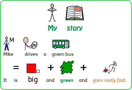
Formatting Text
The text is most easily changed using the Edit tab. Highlight the section of text that you want to change and then use the options on the tab.
|
Change the font - Select the font from the drop-down box |
|
Font Colour - Select this to bring out the pallete. The icons shows you the current colour |
 |
Bold |
 |
Italic |
 |
Underline |
You can also access the full Text and Symbol Formatting dialog by clicking the More Options  button in the Font section of the Edit tab.
Change Case
|
You can change the capitalisation of highlighted text, or text within selected objects, by choosing an option under Change Case on the Formatting tab. |
-
Sentence Case:
This is my story. It’s about a black cat. -
Lower Case:
this is my story. It’s about a black cat. -
Upper Case:
THIS IS MY STORY. IT’S ABOUT A BLACK CAT. -
Capitalise Each Word:
This Is My Story. It’s About A Black Cat.
Notes on the Colour Palette
|
You can change the colour of text by selecting from the colour palette. You can define your own colours and use them to style any object in your document. You can also save colours to My Colours so that they are available whenever you use the program. |
Notes on Fonts
The default and recommended font supplied is the highly accessible FS Me font. This font has been designed to aid legibility for those with learning disabilities by Fontsmith and Mencap. You can find out more about FS Me at:
http://www.fontsmith.com/projects/portfolio/mencap-fs-me.cfm
NOTE: Although this font is included with some Widgit products, you will not be able to access it from other Windows programs unless you purchase a license for the font.
Format Painter
When you have styled your text you can use the Format Painter to copy formatting from the selected text onto other content.
|
To do this, click on the text you wish to copy, select the Format Painter from the Formatting Tab. |
-
Left click on a frame to change all the text within that frame.
-
Highlight over text to change just the desired text.
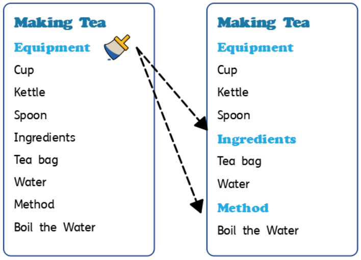
Boxed Words

Boxed Words is a formatting property that allows symbolised content to be displayed with a simple box drawn around the text and symbol, or just around the symbol.
This concept was introduced by Dr. Antonella Costantino in Italy, and is a required feature for AAC software in that country. Traditionally, content would be displayed in monochrome with text above the symbols, but a visible bounding box is required for both colour and where text is underneath the symbols.
Turning Boxed Words Controls On/Off
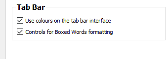
To display the controls for Boxed Words formatting:
-
Click on Settings from the Launcher screen.
-
On the Interface tab, click the box labelled Controls for Boxed Words formatting in the Tab Bar section. To remove the controls, remove the tick from the box.
-
Click OK to confirm the change.
If enabled, the Boxed Words controls will be found in the symbols section of the Formatting toolbar.
Using Boxed Words
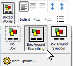
To apply Boxed words formatting to a frame(s), click on the frame to select it; then click on the Boxed Words icon located in the Symbols section of the Formatting tab.
From here you can choose three different formatting modes:
Box Around Everything - In this mode a box is drawn around the entire text and symbol of the word.
Box Around Symbols - In this mode a box is drawn around just the symbol for each word.
No Box - In this mode no box is used in the formatting.
Boxed Words Formatting
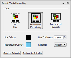
The colour, thickness, and padding of the box used in Boxed Words formatting can be changed if you click the More Options icon on the Boxed Words dialog.
You can choose a different Box Colour and Background Colour from a basic or advanced colour palette. The thickness of the box can be changed using the up and down arrows in the Line Thickness box or by typing in a value manually. The Padding can be adjusted from the drop-down menu, which contains three options: small, medium and large.
You can then save your changes as the default by clicking the Save as Default button.
To restore the default settings, click the Restore to Defaults button.
Changing the Size of Symbols and Text
Notes: The sizes of symbols and text are designed to work together. A symbol size of 14 is a good match for text sized at 14.
When using Symbol Only Mode the text size controls will be greyed out and unavailable.
You can change the size of symbols and text independently or together.
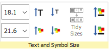
|
You can change the size of symbols or text using the corresponding size drop-down box. |
|
You can change the size of the symbols and text together using the Symbol and Text Size buttons. |
Tidy Sizes
You can make the content in multiple table cells or multiple frames a consistent symbol and text size.
|
To do this select the table, or multiple objects you wish to change, and press the Tidy Sizes button on the Edit tab. This will make all the sizes the same as the smallest object. |
Selecting Content to Change the Size
To change the size of a symbol or text, highlight the content you wish to change and use the options on the Edit tab.
Alternatively you can select the entire object that contains the content such as a frame or table. This will change all of the content for that object.
Please note: the outcome of any size change can depend on what Sizing Type the containing object is on. More on Sizing Types
Symbol Colours
You can change the colours of symbols to personalise your vocabulary and make the document most appropriate for the end user. You can change:
-
Symbols from colour to monochrome
-
Change the line colour
-
Change the skin colour
-
Recolour individual symbols
Switching Between Colour and Monochrome Symbols
All Widgit Symbols can be displayed either in colour or monochrome.
|
Select the content you wish to change and click the Show in Colour button on the Edit tab to toggle symbol colour on and off. |
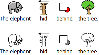
Changing the Line Colour of Symbols
The line colour of all Widgit Symbols can be edited in much the same way text colour can. This is most useful to assist with visual impairment. When you change the line colour of a symbol the program will change the symbol to monochrome.
To edit the line colour, select the content that you want to edit and click the More Options button in the Font section of the Edit tab to show the Text and Symbol Formatting dialog.
|
Choose the Symbols Line Colour you would like to set as the line colour. You may want to change the frame background colour to give a good contrast with the symbol line colour. This can be especially useful for readers with a visual difficulty. |


Skin Tones
You can change the skin tone for any of the person symbols. Select the content you wish to change and press the the skin tone button on the Edit tab. This will bring up a small box featuring all the possible skin tone options. To change the skin tone, click on the desired tone. Varied Skin TonesAs well as setting the 'base' skin tone, you can also choose to use Varied Skin Tones. This will change any symbol that contains more than one person to display in variety of skin tones. |
|
Changing the Colours in a Symbol
You can change the colours in a symbol in order to make it as specific as possible. For example, when making reference to a coloured item of clothing, such as a “green shirt” (see the example below), you will find that two differently coloured symbols may appear. Changing the colours in a symbol and editing the associated text can give greater clarity to the symbol reader.

![]() Place the cursor in the word you wish to change and then select the Edit Colour button from the Edit tab.
Place the cursor in the word you wish to change and then select the Edit Colour button from the Edit tab.
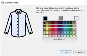
In the Edit Colour dialog box, you can click on specific parts of the symbol in the preview pane to select which colour to edit. Alternatively, you can click on the colour palette buttons.

NOTE: You can also apply the same method for changing the colour of a Widgit media image or a symbol dropped in as a graphic.
When you have finished editing the symbol, you can bring related words together under the new symbol. For this example, highlight the text “green shirt”. Then right-click on the new symbol and from context menu and select Set this symbol for the selected text.

Changing the Colours for the whole document
|
You can change the symbol colour mode, skin tones and line colour for all content within the document. Click Select on the Page Status Bar at the bottom of the screen, then choose Select All, Select Frames or Select Tables to focus the objects you want to change. Note: When you select objects over multiple pages, you cannot move or resize them. |
Qualifiers: Grammatical Markers
A symbol may have a qualifier to indicate whether it is plural, a past tense, a comparative or superlative.
-
Plural
-
Comparative
-
Past tense
-
Superlative

Qualifiers can be switched on or off for either individual symbols, or for the whole document.
Changing Individual Symbols
To turn qualifiers on or off for an individual word, click on the word and then use the Qualifier buttons on the Edit tab.
 |
Plural Qualifiers – for adding or removing plural qualifiers |
 |
Tense Qualifiers – for adding or removing tense qualifiers |
 |
‘Er/Est’ Qualifiers – for adding or removing comparative and superlative qualifiers |
Changing the Qualifiers for the whole document
|
You can change the qualifiers for all content within the document. Click Select in the Page Status Bar at the bottom of the screen, then choose Select All, Select Frames or Select Tables to focus the objects you wish to change. Then use the Qualifier buttons on the Edit tab. Note: When you objects selected over multiple pages, you cannot move or resize them. |
Paragraph Formatting
Text Align
Text in frames and tables can be aligned left, centre or right using the Align buttons on the Edit tab.


Text Spacing
You can increase and decrease the space between lines of content and between words within a frame or cell.
|
Increase the space between lines. |
|
Decrease the space between lines. |
|
Increase the space between words. |
|
Decrease the space between words. |
Indents
You can indent selected paragraphs of text. You can change a single paragraph by clicking in it, or you can select multiple paragraphs in a frame.
Indents will be at a standard increment of 15mm, or you can create your own Tab Stops for custom indentation.
|
To insert a paragraph indent, or increase the size of an existing indent, click on the Increase Indent button on the Edit tab. |
|
To decrease the size of an indent, click on the Decrease Indent button on the Edit tab. |
Bullets
|
To apply bullets to any paragraph (or selected set of paragraphs), simply click the Bullet button on the Edit tab to switch the bullets on and off. |
Spacing and Position
In spacing and position settings you can change the line and character Spacing and Symbol Position.
To access the Spacing and Position dialog, click the More Options  button in the Paragraph section of the Edit tab.
Spacing
You can choose to alter the horizontal spacing between words or symbols. You can also alter the spacing between lines, and add extra space between paragraphs.
-
Horizontal spacing affects the space between words
-
Line spacing affects the space between wrapping lines
-
Extra space between paragraphs affects the amount of space between paragraphs
-
Spacing between letters affects the amount of space between individual letters
Symbol Position
In your document, you can choose whether you would like to see text above or below symbols. To change this select Symbols Above Text or Text Above Symbols in Paragraph Settings .
Text Above Symbols: 
Symbols Above Text: 
Tab Stops
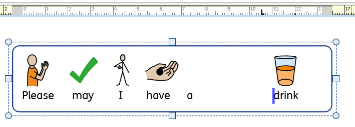
Tab Stops can be used to enable InPrint 3 users to align text by pressing the tab key. Tab Stops can be added to paragraphs in document frames or table cells.
By default, paragraphs in new frames and cells have tab stops every 1.5cm.
Adding a Tab Stop
|
To add a Tab Stop you first need to select the frame or cell you want it to apply to. Then click on the Horizontal Ruler at the top of your document. When a Tab Stop is added, it is represented on the Horizontal Ruler with a blue Tab Stop indicator. |
Note: A Tab Stop will only be applied to the selected frame or cell.
Moving a Tab Stop
|
To move a Tab Stop click and hold on the blue Tab Stop indicator on the Horizontal Ruler. This will show a temporary guide line across your document, indicating the position of the Tab Stop. Drag the indicator left or right to move the position of the Tab Stop, release the mouse button when it is in your desired position. |
Remove or Edit a Tab Stop
|
To remove a Tab Stop click and hold on the blue Tab Stop indicator on the Horizontal Ruler, then drag downwards. Alternatively you can double-click on the blue Tab Stop indicator to display the Edit Tab Stops dialog box which can be used to remove or change the position of the Tab Stop(s). |
Styles
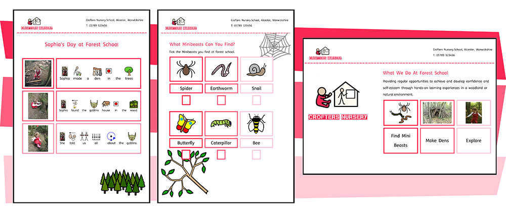
InPrint 4 provides you with a range of features which allow you to customise the visual styling of objects in your resources.
If you find yourself creating objects with the same appearance over and over again the Format Painter and Pinned Stylesfeatures will save you time and prevent you making the same visual changes each time. You can 'paint' formatting from other objects and text. You can 'Pin' different styles for frames, tables and lines. These styles will be available each time you open the software and will remain until you pin a new style.
Colour palettesavailable on the tab bar can be used to change the colour of objects within your resource. You can choose from a basic colour palette or specify a custom colourwhich is particularly useful if you want to create a resource in the colours and branding of you organisation. These custom colours can then be saved for future use on the document colours paletteor the my colours palettewhich appears each time you open the program.
Format Painter
The Format Painter is designed to be a very simple way of copying formatting from one place to another.
|
To use the Format pPainter, select the object or text that you wish to copy, then click on the Format Painter on the Formatting tab, or by pressing Ctrl + Shift + C. This will copy the formatting from the selected object. Your mouse cursor will change into a ‘brush’ icon. Now left click on the objects or text that you wish to restyle. You can click on several objects to keep pasting the new style. Right click to stop pasting the formatting. |

Formatting Different Objects
-
Change all of the text with in a frame/cell by clicking once on the frame/cell.
-
Change a whole table by clicking on the edge selection points of the table.
-
Change just the desired text by highlighting it.

Format Painter Options
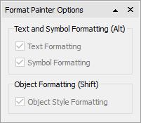
Open the Format Painter Options by selecting the down arrow next to the Format Painter on the Formatting tab.
Text and Symbol Formatting only
From here you can select to just paste the Text and Symbol formatting, or by pressing Alt when you click:

Object Formatting Only
From here you can select to just paste the Object Style formatting, or by pressing Shift when you click:

Pinned Styles
A Pinned Style is a collection of visual style settings that have been “pinned” by the user for later re-use.
If you find yourself creating frames, tables, or lines with the same appearance over and over again it can be useful to 'Pin' the style to save you making the same visual changes each time.
You can 'Pin' different styles for frames, tables, and lines. These styles will be available each time you open the software and will remain until you pin a new style.
Pinning a Style
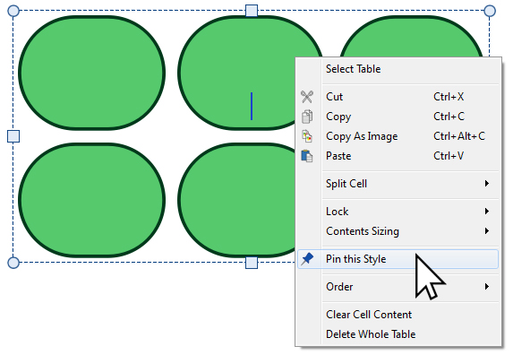
After making changes to the appearance of your selected object you can right-click and select the Pin This Style option from the drop-down.
Pinned styles will remember the following visual settings:
Tables
|
Frames
|
Lines
-
Line colour and thickness
-
Line dash style
-
Line end style
Using a Pinned Style

Click on the Create toolbar on the left side of the screen to create an object using your Pinned Style.
Colour Palette
InPrint 4 lets you customise the colour of objects in your resources. On the tab bar, you will find colour palettes which you can use to change the colour of text, frames, tables, lines, speech bubbles, symbols etc.
Basic Colour Palette
|
When you click on a colour palette you will be shown a selection of colours you can click on to edit the appearance of the object you have selected. |
Transparency
|
As well as selecting from a range of colours, the colour palette can also be used to make an object completely transparent or partly opaque. Select the Transparent option on the right of the colour palette to make the selected object completely transparent. Use the slide bar on the right of the colour palette to set a level of opacity for the selected object. |
More Colours
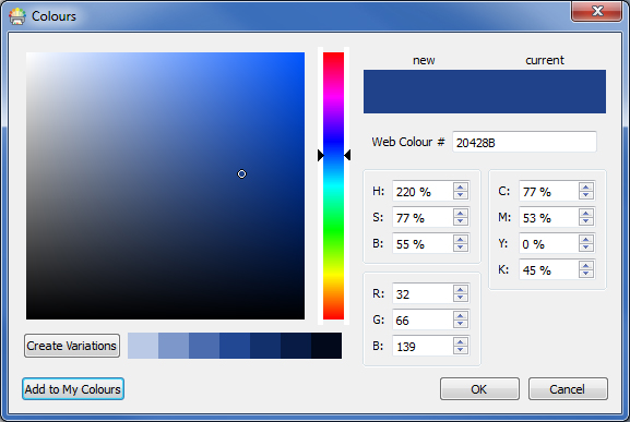
At the bottom of the basic colour palette you have an option to view More Colours. If you click this you will be shown a dialog you can use select a custom colour using any of the values below:
-
Web Colour #
-
HSB (Hue, Saturation, and Brightness)
-
RGB (Red, Green, and Blue)
-
CMYK (Cyan, Magenta, Yellow, and Black)
This is particularly useful if you want to use a colour related to your organisation logo or branding.
The Create Variations button will create 3 lighter shades and 3 darker shades of the currently selected colour, giving you a range of matching colours to use in your resources.
The Add to My Colours button can be used to add a selected colour to your custom My Colours palette which can be used throughout the program.
Custom Colours
InPrint 4 gives you the option to customise the appearance of objects in your resources by selecting alternative colours for them from a standard colour palette. It also gives you the option to use custom colours which is particularly useful if you want to use a colour related to your organisation logo or branding.
There are 3 colour palettes available to use within InPrint 4:
Document Colours Palette
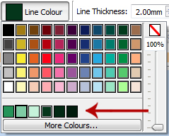
Using the same set of colours throughout your document is a great way to make a professional looking resource.
The document colours palette keeps track of custom colours you have used in a particular document and makes them available when choosing the colour of other objects.
For example, If you use a custom colour for a frame the same colour will be available when you choose a colour for your text or the colour for a line you have created.
Once a custom colour has been used in your document it will appear at the bottom of the standard palette.
Note: If a colleague opens a document you have created they will still have access to the documents colours palette.
My Colours Palette
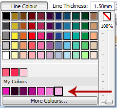
If you want to use the same set of custom colours in every document you create you can add them to your My Colours palette.
To add a colour to My Colours Palette select More Colours from the palette drop-down. From this dialog, you can set your custom colour, then click the Add to My Colours button.

The My Colours Palette is available underneath the basic colour palette and the document colours palette (if any have been used) and is available every time you open the software.
Deleting My Colours
To delete a colour from the My Colours Palette, right click on it and select Remove from My Colours.
Note: If a colleague opens a document you have created using colours from your My Colours palette, these colours will be available to them on the document colours palette.
Arranging Objects

The Arrange tab contains a number of tools to help you with the organisation of the various objects you have used to create your resource.
You can use the Arrange tab to:
-
Order objects i.e. move items to the foreground, middle ground, and background
-
Align objects along a specified axis (horizontal or vertical)
-
Distribute objects evenly either horizontally or vertically
-
Combine several objects into a Group so that they are treated as a single unit
-
Lock the contents, size and position of any object.
-
Work with Cells to split tables and create a table from a frame.
Order
You can change the stacking order of objects to move them in front of or behind each other.
Select an object and use the buttons in the Order section on the Arrange tab, or right-click on the object to open the context menu and choose from the Order sub-menu.
 |
Send to Back or Ctrl + Shift + [ |
 |
Send Backward or Ctrl + [ |
 |
Bring Forward or Ctrl + Shift + ] |
 |
Bring to Front or Ctrl + ] |
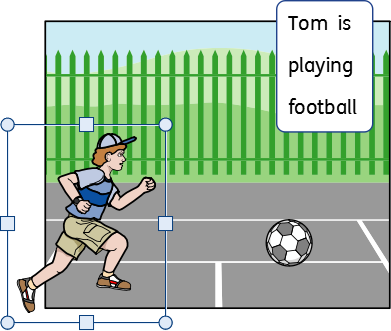
Align
You can align objects along the axis you specify (horizontal or vertical). You can align either the edges of the items or the centre.
To align objects select them, by dragging over them or using Ctrl + click, and click the Align buttons on the Arrange tab.
 |
Align Left |
 |
Align Vertical |
 |
Align Right |
 |
Align Top |
 |
Align Horizontal |
 |
Align Bottom |
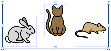

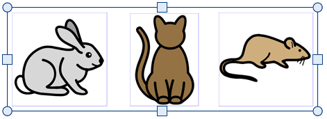
Distribute
You can distribute objects evenly either horizontally or vertically. You can distribute either the centre points of the objects or between the edges.
To distribute objects select them, by dragging over them or using Ctrl + click, and click the Distribute buttons on the Arrange Tab.
 |
Distribute Centres Horizontally |
 |
Distribute Centres Vertically |
 |
Distribute Edges Horizontally |
 |
Distribute Edges Vertically |


Distribute Centres Horizontally: 
Distribute Edges Horizontally: 
Grouping

You can combine several objects into a group so that they are treated as a single unit. You can then move or re-size this as one object rather than making individual changes. For example, you may have created a resource which contains many frames, arrows, and images. Moving all of these objects individually to make space for additional content could take some time, however grouping them all together means you would only need to move one object.
|
To group objects, select them by dragging over them or using Ctrl + click, and press the Create Group button on the Arrange Tab. |
|
You can remove objects from the group by selecting the group and then clicking on the Ungroup button on the Arrange Tab. |
You can also *Ungroup* by clicking on the icon in the top left corner of the group. 
Resizing groups and ungrouped objects
When you resize a group, the whole group is resized as one object.
When you resize multiply selected object, each object is resized individually but in proportion to each other.
Resizing a group

Resizing multiply selected objects

Locking
You can lock items by selecting them then selecting one of the Lock options from the Arrange tab.
|
Locking Size and Position means that you cannot resize or move the frame. You can still edit the content and change the styling. |
|
Locking Contents means that you cannot edit the content and styling. You can still move and resize the frame. |
A frame that is locked will show one of the lock indicators when selected.
Cells
Split Table
|
You can break apart the cells in a table to create a collection of frames by selecting Split Table. |

Create Table from Frame
|
You can create a table of identical cells. This is particularly useful for creating sticker sheets. Create and style a frame with the desired content. Select Create Table from Frame, then move your mouse until you see the desired number of cells. Then left click to confirm. |

Pages
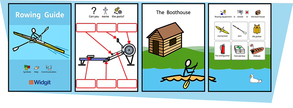
InPrint 4 will allow you to create a wide variety of resources across single or multiple pages.
Using the Pages tab and Page Manager you can:
-
Adjust your Document Layout by adding, removing, duplicating and ordering pages
-
Edit Page Properties such as orientation, paper size and margins
-
Add Headers and Footers to your resources
-
Use the Page Status Bar to create locked items
Navigation
You can navigate around your document in a number of ways:
Scrolling
You can use your mouse scroll wheel or the scrollbar at the side of the page to move up and down through your document.
 You can also use the Previous and Next page buttons on the scrollbar to jump between pages. Using these buttons will take you to the previous or next page spread, but keep the current zoom and viewport position.
Navigation Buttons
You can use the Navigation buttons on the Pages tab.
 |
Go to the First Page |
 |
Go to the Previous Page |
 |
Go to the Next Page |
 |
Go to the Last Page |
You can also define which page to jump to by using the spin box then clicking Go to Page.
Page Manager
Click on Open Page Manager in the Page Status Bar at the bottom of the screen.
This will show you a preview of all the pages in your document. Click on a page to navigate to it.

Page Status Bar
The Page Status Bar runs along the bottom of the screen.
![]()
From this bar you can:
-
Open the Page Manager
-
Select different objects across the whole document
-
Open the Measurement and Locking dialog
-
Fit to height to makes a page size fit entirely
-
Fit to width ensures that the width of the document fills the available space
-
Set the zoom level
Select
You can use the Select tools to select objects across the whole document. This can be particularly useful for changing the style properties of all objects at once. You can select:
You can also select items above and below the current object by selecting Select Next and Select Previous. |
|
Note: When you select objects over multiple pages, you cannot move or resize them.
Measurement and Locking
|
When you have an object selected, its current top left X and Y co-ordinates are displayed in cm on the status bar. |
Clicking on these numbers opens and closes the Measurement and Locking dialog. From this dialog, you can set for the selected object:
|
|
Locking
 |
Locking Size and Position means you cannot resize or move the object, but you can still edit the content and change the styling. |
 |
Locking Contents means you cannot edit the content and styling, but you can still move and resize it. |
An object that is locked will show one of the lock indicators when selected.
You can also lock items from the Arrange tab.
Related Sizes
You can set whether the Width and Height and linked or not. When the width and height are linked the object will keep its original aspect ratio.
 |
Width and height linked |
 |
Width and height not linked |
Document Layout
Adding Pages
|
You can add single pages by clicking the Add Page button on the Pages tab. |
|
Insert Page Before the current page |
|
Insert Page After the current page |
|
You can add multiple pages by using the Page Manager |
Deleting Pages
|
You can delete a single page by navigating to that page then clicking the Delete Page button on the Pages tab. |
|
You can delete multiple pages with the Page Manager. Click the Page Manager button on the Page Status Bar at the bottom of the screen to open the Page Manager. Select the pages that you want to delete with Ctrl + click to select individual pages, or Shift + click at each end of a group of consecutive pages, then click the Delete button. |
Ordering Pages
You can change the order of pages in your document from the Page Manager accessed from the Page Status Bar at the bottom of the screen.
To move a page, click on it once then drag it to the desired position. If you wish to move more than one page, press Ctrl + click on the individual pages you wish to move.
Duplicating a Page
You can duplicate any page in your document from the Page Manager accessed from the Page Status Bar at the bottom of the screen.
|
Select the page you wish copy and click the Duplicate button. You can then set how many copies of this page you wish to create. |
Book Mode
You can view your document in two modes:
-
Page Mode for documents intended to be printed as separate pages. One page is displayed at a time.
-
Book Mode for documents intended to be printed as a folded book. Two Pages are displayed at time (a Page Spread).
In Book Mode the the first page appears as a single page as this is the Cover.
Page Mode:
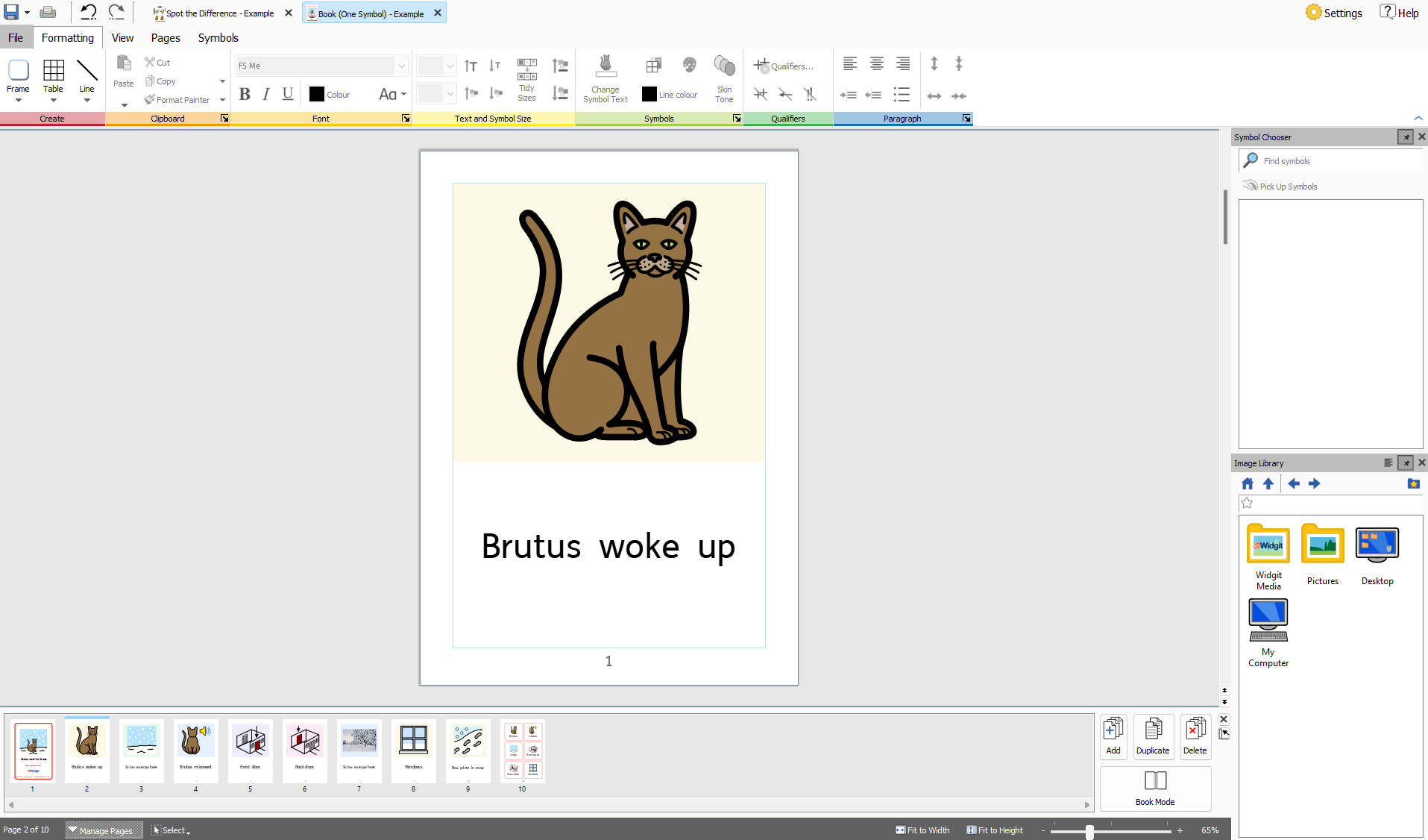
Book Mode:
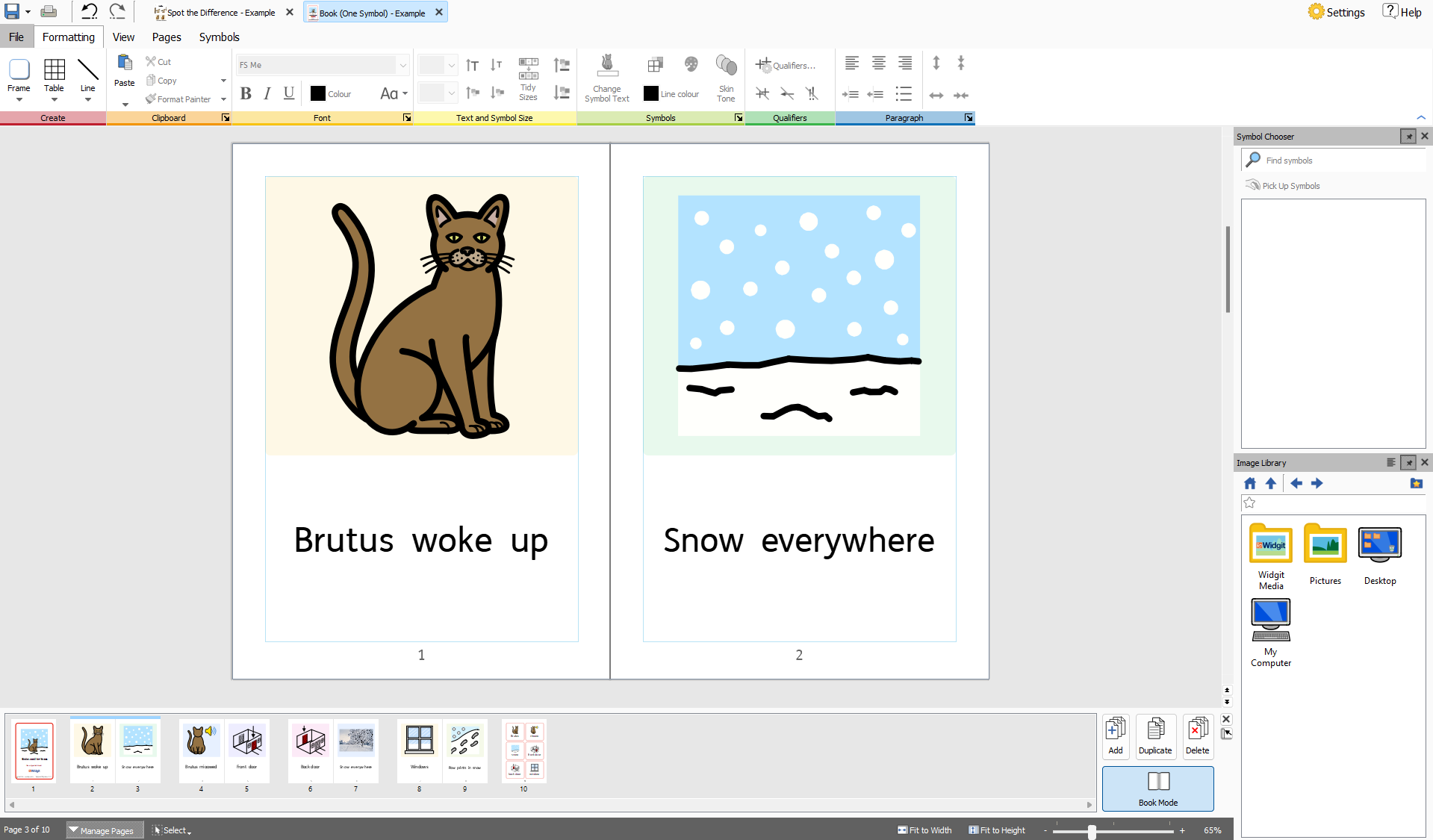
Changing Modes
|
To change between modes select Book Mode from the Pages tab or the Page Manager. |
Working in Book Mode
You can rearrange Page Spreads using the Page Manager. To move a spread, click on it once then drag it to the desired position. If you wish to move individual pages, rather than a spread, press Ctrl + click on the individual pages you wish to move.
When you are working in Book mode you can place images and frames over both pages in the Page Spread.
Note: If you reorder a single page in a spread that contains an object that was across two pages, the object will be left on the original page.
Page Manager:

Page Manager
You can use the Page manager to manipulate your document as a whole.
The Page manager is accessed from the Page Status Bar at the bottom of the screen.

Orientation
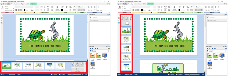
|
You can change the page manager to be vertical or horizontal by selecting Change Orientation. |
Add Pages
|
You can add multiple pages by clicking the Add button. You can choose the number of pages to add and if they are positioned before or after the currently selected page. |
Delete Pages
|
You can remove the selected page by pressing the Delete button. You can remove multiple pages by selecting them using Ctrl + clicking on the pages you require, then click the Delete button. |
Duplicate Page
|
Select the page you want to copy and click the Duplicate button. You can then choose how many copies of the page you want to create. |
Ordering Pages
You can use the Page Manager to change the order of pages in your document.
To move a page, click on it once and drag it to the desired position. If you want to move more than one page, Ctrl + click on the individual pages you want to move, then drag them to the new position.
Changing Modes
|
You can change your document into Book Mode or single pages by pressing the Book Mode button. |
Page Properties
Margins
The Page Margins are the border of the page that items will snap to.
The Page Margins can be set to different widths from the Margins button on the Pages tab.
|
None - No page margins |
|
Narrow - 10mm margin |
|
Normal - 18mm margin |
|
Wide - 28mm margin |
|
You can also set your own Custom Margins. |
Orientation
|
You can set the rotation of your document from the Orientation button on the Pages tab. Pages can be: |
|
Portrait |
|
Landscape |
Paper Size
|
You can change the size of your document by selecting Paper Size from the Pages tab. The standard sizes are: |
-
A3
-
A4
-
A5
-
US Letter
-
US Legal
-
US Executive
You can also set up your own paper size in Custom.
Paper Numbers
|
You can add page numbers to any frame or cell. You can set which page the numbering starts at by clicking the More Options |
|
Click the Page Number button to add the number of the current page. |
|
Click the Page Count button to add the total number of pages. For example “Page 2 of 6” |
Header and Footer
Objects added to the Header and footer appear on all pages in the document. Objects in the Header and Footer will be positioned behind the other page content.
When you are editing the Header and Footer, all regular page content will be visible but not selectable.
You can place objects anywhere on the page. You can also use the guides to define an area for your Header and Footer.

Adding a Header and Footer
|
You can turn on the Header and Footer by selecting Edit Header and Footer on the Pages tab. Turning on the Header and Footer will display the Header and Footer Guides and add two clear frames which will be added at the top of the page and bottom of the page, in Text-only mode. The Header and Footer tab will also be visible. |
Changing Edit Modes
 |
You can enter Edit mode by double-clicking on a Header Footer object, or by selecting Edit Header and Footer on the Pages tab. |
 |
You can exit Edit mode by double clicking on an object of regular page content, or by selecting Close on the Header and Footer tab. |
Navigating
You can jump to to the bottom or top of the page by selecting the Navigation buttons from the Header and Footer Tab.
 |
Go to the Header |
 |
Go To the Footer |
Page Numbers
You can add page numbers to your header or footer.
 |
Click the Page Number button to add the number of the current page. |
 |
Click the Page Count button to add the total number of pages. For example “Page 2 of 6”. |
You can set which page the numbering starts at by clicking the More Options  button.
Remove Header and Footer
|
You can delete all of objects by selecting Remove Header and Footer. |
Move Content to Page
|
You can move all of the header and footer content into the actual pages, so that the content can be edited individually . Do this by selecting Move Content to Page. This also removes the content from the header and footer. |
Header Position
|
You can choose whether the header and footer contents appears above or below the page content by selecting In Front of Page Content or Behind Page Content. |
Header and Footer Options
You can choose to not have the Header and Footer appear on all pages. You can set the Number of First pages and Number of Last pages that don't contain the Header and Footer. This can be useful when creating books and wish to have different content on the cover pages.
You can also choose to have a different Header and Footer on Odd and Even Pages. This can be useful if you are creating a book and wish the page numbers to be on the outside edge of the book.
Header and Footer Guides
|
You can use the Header and Footer guides as a reference to layout your header and footer. objects will snap to the guides. You can set Header Height and Footer Height on the Header and Footer tab. |
View
The View tab allows you to:
-
Zoom
-
Hide and display panels
-
Manage rulers, guides, grids and snapping

Zooming
Choose the level of zoom that suits your document.
You can change the zoom level (10% to 400%) from both the View tab and the Page Status Bar.
|
Fit to Width makes width of the document fill the available space. |
|
Fit to Height makes a page size fit entirely. |
Panels
|
You can choose whether or not to display the Symbol Chooser and Image Librarypanels. By default, the panels are 'pinned' to the toolbar on the right of the document. You can unpin the panels and move them to wherever you want on the screen. |
The panels can also be positioned one above the other, so that you see them both at the same time, or on top of each other, where you can switch between them using the tabs at the top of the toolbar.
Symbol Chooser |
Image Library |
Showing Rulers, Grid and Guides
|
Select Show Rulers to toggle whether the rulers are visible or not. |
|
Select Show Grid to toggle whether the grid is visible or not. |
|
Select Show Guides to toggle whether the guides are visible or not. |
Working with Guides
Adding Guides
You can add guides in 2 ways:
-
Dragging a guide from the ruler, either vertically or horizontally.
-
Selecting the Create Guide button from the View tab. This gives you greater control of the position of the guide.
When you create a guide you can set the distance from the top left of the page, either horizontally or vertically. You can set which page the guide appears on. And if it is a Page Guide or Document Guide.
|
|
Editing Guides
You can drag a guide to move it, unless it is locked.
To edit an individual guide right-click on it to bring up the context menu. From here you can:
-
Convert the line into a Document Guide or Page Guide
-
Lock and Unlock the Guide
-
Delete the guide
-
Delete All Guides in the document
-
Access the Guide Properties to position the guide in a precise way
Grid and Guide Settings
|
|
Snapping
When you move items around a page they will snap to the Page Margins and the centre points of the page. You can also set items to snap to other things:
|
Snap to Grid makes objects snap to the background grid, even if it's not currently visible. |
|
Snap to Content makes objects snap to other objects. This is particularly useful when you want to line up different objects on the page. |
|
Snap to Indicators makes objects snap to the guides and page margin. |
Printing
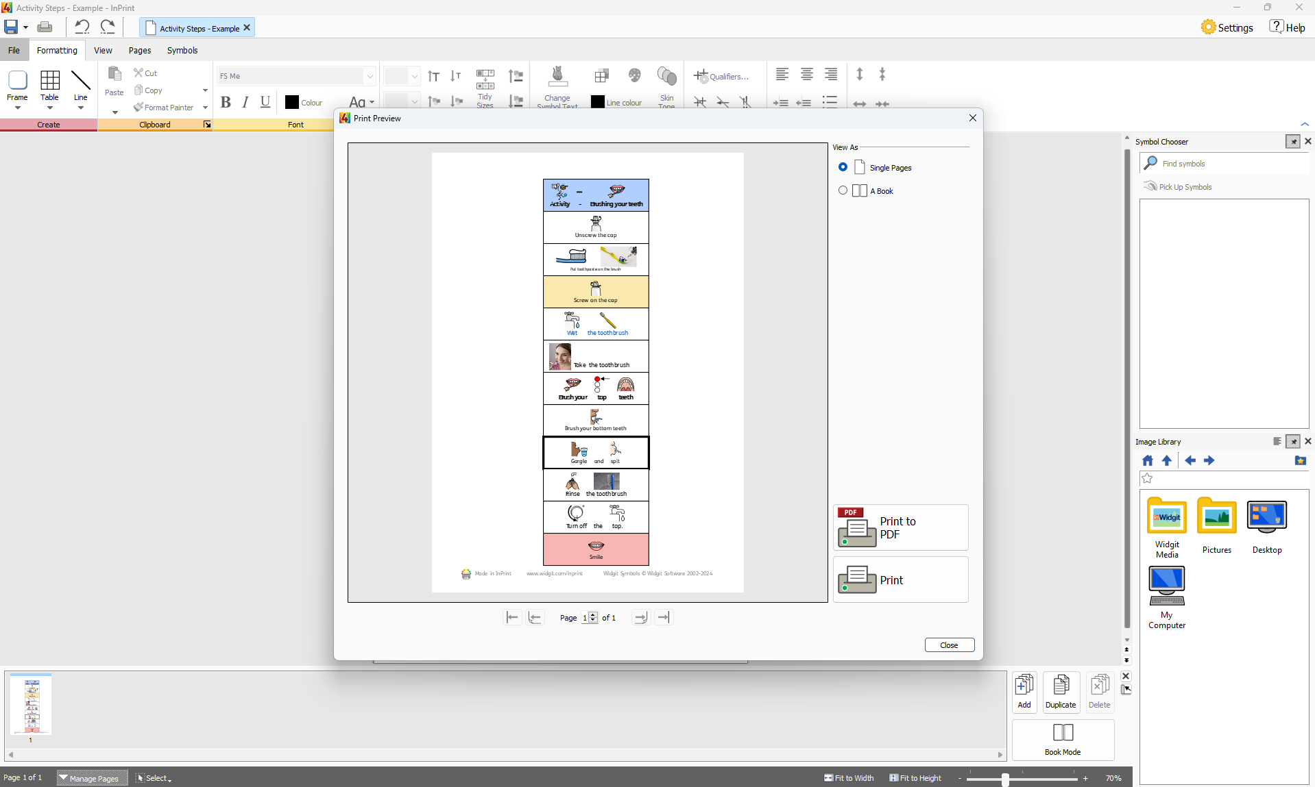
You can print documents from the Print Preview screen, or by pressing Ctrl+P while editing a document.
On the Print Preview screen, you can view a document as single pages or as a book. You can toggle between pages and see what the document will look like when printed.
You can also choose to Export your document as a PDF file from the Print Preview screen.
To open the Print Preview screen, click the File tab.
Navigation Controls
![]()
Use the navigation controls at the bottom of the Print Preview screen to move forwards or backwards through the document, or jump directly to a specific page.
If the preview is displaying Page Spreads , typing a page number into the spin box will navigate to the spread which contains that page.
View Options
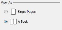
Print Preview allows you to view your document in two modes:
-
As Single Pages. One page is displayed at a time.
-
As a Book. Two Pages are displayed at time (a Page Spread).
Note: If you select to view the preview as a book and the number of pages in the document is not currently a multiple of four, a warning will be shown, advising how many pages the user needs to add or remove to make the document printable and able to be bound as a book.

To Print your document click the Print button in the bottom right corner of the Print Preview screen.
You will then be shown a print dialog which will allow you to select options for that particular print job. For example, you can select the printer you want to use, the range of pages to print, and the number of copies to print.
Export to PDF

InPrint 4 can export open documents to PDF (Portable Document Format) from the Print Preview screen.
After clicking the export button on the Print Preview screen you will be able to choose the location your PDF file will be created, You can also choose to export all pages in your documents or a selection.
Symbols and Vocabulary

The Symbols tab allows you to manage your vocabulary by:
Wordlists Overview
A Wordlist is a file that links words with graphics. If you type 'cat' in Symbol Mode while using InPrint 4, the loaded Wordlist will automatically display the symbol associated with the word 'cat'. The symbols displayed when you type will vary according to the loaded Wordlist(s) in InPrint 4.

You can choose to enable or disable different types of Wordlists in InPrint 4 depending on how you want to use the program. You can also use InPrint 4 to create your own Wordlist.
Types of Wordlist
The Widgit Symbols
(Smart Symbolising) Wordlist is linked to the entire Widgit Symbol Database and is the only Wordlist that can have the Smart Symbolising function active. With each software update, the Widgit Database will also be updated - ensuring that you have the largest and most up-to-date vocabulary.
Note: You cannot edit the Widgit Symbol Database, but you can select your default symbol choices.
User Wordlist
This Wordlist file is associated with your Windows Profile, therefore any changes that you make to this Wordlist will only be accessible by you unless you share log-on details. There is only one user wordlist per user.
NOTE: The user Wordlist is always active
Topic Wordlists
These Wordlist files are generally reserved for short Wordlists for small sets of topic-specific words. These files are also easily shared amongst different users. When a document that is using a Topic Wordlist is saved, the Wordlist and all of its entries will be integrated with the file. If you load this file on another computer, the Wordlist, along with the document content will be accessible. Most resource packs are likely to have a Topic Wordlist included, such as an 'Ancient Egyptian History' Wordlist for example.
Symbol Set Wordlists
This Wordlist file is the largest kind of Wordlist and is usually comprised of alternative symbol sets that are often made by third-party companies like Makaton. This Wordlist is not easily shared like a Topic Wordlist because it is not integrated with InPrint 4 documents although it is recognised by it.
Starting Default
When you first launch InPrint 4, the default active Wordlist will be your User Wordlist in conjunction with the Widgit Symbols Database (Smart Symbolising).
Loading Wordlists
To manage the Wordlists currently active and available to InPrint 4, you can use the Symbols tab and select Symbol Settings.
Using this dialog, you can configure how symbols will function according to your Wordlist preferences.

In the Symbols section, you can choose between Use Widgit Symbols, that will enable both Smart Symbolising and access to the Widgit Symbol Database (as well as any enabled Topic Wordlists) and Use Wordlists Only, that will only symbolise according to enabled Wordlists in the In-use Wordlists panel below.
Wordlist Section
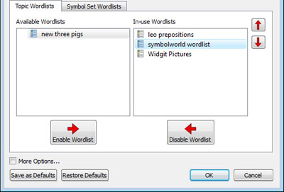
The panel on the left will display all of the available Wordlists that you can Enable.
The panel on the right will display all of the ‘enabled’ Wordlists for your current document.
The Wordlist at the highest position will automatically be given symbol preference over the other Wordlists. You can use the Up and Down arrows to the right of this panel to change the order of the Wordlists.
Advice on Opening Multiple Wordlists
Mixing different symbol sets can confuse the reader, as different symbols sets visualise concepts differently.
If you choose Use Widgit Symbols and enable a Symbol Set Wordlist you will receive a warning message. You will be able to proceed but it is not recommended.
If you know the sets and their structure then it is OK to mix sets, for example mixing an additional Photo Library with the Widgit Symbols. If you do not, it is best to avoid mixing as they may represent concepts in different ways.
NOTE: Enabling the Widgit Symbols and a Symbol Set Wordlists may also result in the program running more slowly.
Saving Wordlist Changes
While you are writing a document, you may add your own vocabulary by:
-
Changing the Words for a Symbol
-
Changing the Image for a Word
-
Changing the Colours in a Symbol
Such changes will be saved to the current document.
You may also decide that you would like to save your changes to use on other documents. You may also wish to simply remove wordlists entries from the document.
You can save and manage your Symbol Changes, and create new Wordlists by selecting the Symbols Tab and clicking Save Symbol Changes.
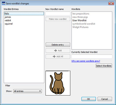
Wordlist Entries Panel
In the panel on the left, titled Wordlist Entries, you will find the new symbols that have been created in your document. What you can see in this panel is dependent on the Filter drop-down box underneath.

When All entries has been selected, you will see all of the entries that you have made.
When Entries in use has been selected, you will see all of the entries that you have made that are currently in your document.
When Entries not in use has been selected, you will see all of the entries that you have made but are not currently in your document.
Wordlists panel
In the panel on the right, titled Wordlists, you will see a list of all of your Topic Wordlists. The User Wordlist will always be loaded. When a Wordlist is grey, it means that the Wordlist is not currently loaded. You can load a Wordlist from this dialog by clicking the Select Wordlists button that will take you to the Symbols and Wordlists dialog.
Create New Wordlist
You can also create a new Wordlist using this dialog. To create a new Wordlist, type a name for the new Wordlist into the space underneath New Wordlist Name and then click Make new wordlist button.

This new Wordlist will automatically be loaded, and added to the Wordlists panel.
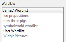
Adding Wordlist Entries
You can add your Wordlist Entries to loaded Wordlists. To add an entry to a Wordlist, first select the Wordlist in the Wordlists panel that you want to add to and make sure it is loaded. Then select the Entry that you want to copy and click the Add button. If you want to add all of your Wordlist entries, click the Add All button.

Deleting Wordlist Entries
You can delete Wordlist Entries by selecting them in the Wordlist Entries panel and then clicking Delete entry. If the entry you are trying to delete is in use, you will not be able to delete it until it has been deleted from your document.
Using InPrint 2 Wordlists
InPrint 2 uses Wordlists with the file extension .cwl and they are saved by default in:
-
C:\Users\Public\Documents\Widgit\Communicate Files\Wordlist
InPrint 4 uses Wordlists with the file extension .cfwl and they are saved by default in:
-
C:\ProgramData\Widgit InPrint 4\Common Files\Topic Wordlists
-
C:\ProgramData\Widgit InPrint 4\Common Files\Symbol Set Wordlists
When you open an InPrint 2 document into InPrint 4, the custom and resource pack wordlists used in the document will be converted and copied to the relevant InPrint 4 folders.
These converted wordlists will be placed into a folder called 'Lists from InPrint 2'.
Manually converting InPrint 2 wordlists
You can use the Wordlist Manager application to convert InPrint 2 wordlists for use with InPrint 4.
To open the Wordlist Manager go to the start menu, then choose:
“All programs > Widgit > Common > Wordlist Manager”
In the Wordlist Manager application, click Open, then choose InPrint 2 (*.cwl). Then select the wordlist you wish to convert.
Click Copy, then choose either Topic Wordlist or Symbol Set Wordlist.
Note: Symbol set wordlists are for long lists or ones containing third party images such as Makaton or BSL graphics.
Then open InPrint 4 and go to the Symbols tab and select Symbol Settings to load the new list.
Restricted Symbols
Some symbols in the Widgit Database could be upsetting or not suitable for some users. Restricted symbols are not displayed by default when you first launch InPrint 4.
To change access to restricted symbols, you can use the Symbols Tab and select Symbol Settings. Click the radio button next to More Options… to reveal the Show Restricted Symbols radio button.
Click the Show Restricted Symbols radio button to view the categories of restricted symbols.
Click the radio button next to the category of restricted symbols that you want to be displayed to enable the symbolisation of those terms.
-
Drug and substance misuse
-
Psychiatry
-
Human reproduction (sex education)
-
Explicit symbols

Changing Language
Your default language will be based on the version of InPrint 4 you have purchased. You may have additional languages available.
-
Changing the language will alter the symbolisation of words and sentences and the spell check.
-
Changing the language does not change the interface.
To change the language a document, select the Symbols tab and choose Set Language.
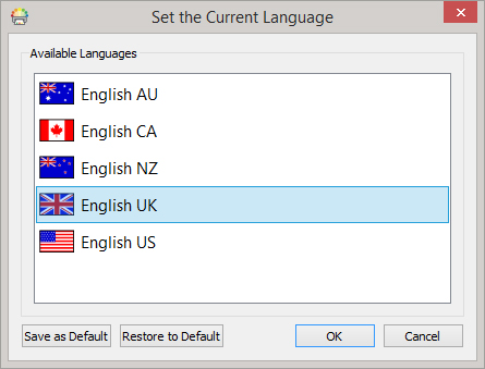
You can also set which language you would like to use for all future documents by selecting Save as Defaults. Click Restore Defaults to restore the original default settings.
Legacy Symbols
Legacy Widgit Symbols are the symbols used before the updates for the 2021 development project.
You can choose to use the Legacy Symbol instead of the updated symbols with varied skin tones.
Legacy Symbols:

2021 Symbols:

You can choose to use the Legacy Symbols from Settings, in the File menu. Then select the System tab and tick “Use Legacy Widgit Symbols”.
Please note that you will not see any new symbol updates when using the Legacy Symbols.
For more information about the 2021 Symbols please visit: www.widgit.com/symbols2021
Spelling
|
InPrint 4 has a pictorial spellchecker. When a spelling error has been made, InPrint 4 will offer suggestions from the dictionary including the associated symbol. This feature can assist with symbol suggestions to help understand the meaning of words and help the correction process. |
Check Spelling as You Type
|
You can choose whether spelling errors will be marked throughout your document or not. To change the spellchecker marking settings, select the Symbols tab and select Check spelling as you type. |
Check Your Spelling
There are two ways to check your spelling:
-
Simple Spell Checker which you can access while typing by right-clicking to open the context menu
-
Full Spell Checker for a complete document check, accessed from the Symbols tab or by pressing the F7 key.
You can also Personalise the Spell Checker by editing the dictionary and suggestions.
Using the Simple Spell Checker
|
To see suggestions for a spelling error, click with the right mouse button on the highlighted word. This will display a list of suggested words illustrated by symbols where possible. If you do not want InPrint 4 to mark this word as a mistake, click Learn This Word. |
Full Spell Checker
You can open the full spell checker from the Symbols tab, or by pressing F7.
The current misspelling will be highlighted in blue and show in context in the top box. The second box contains suggestions for the correct spelling along with symbols.
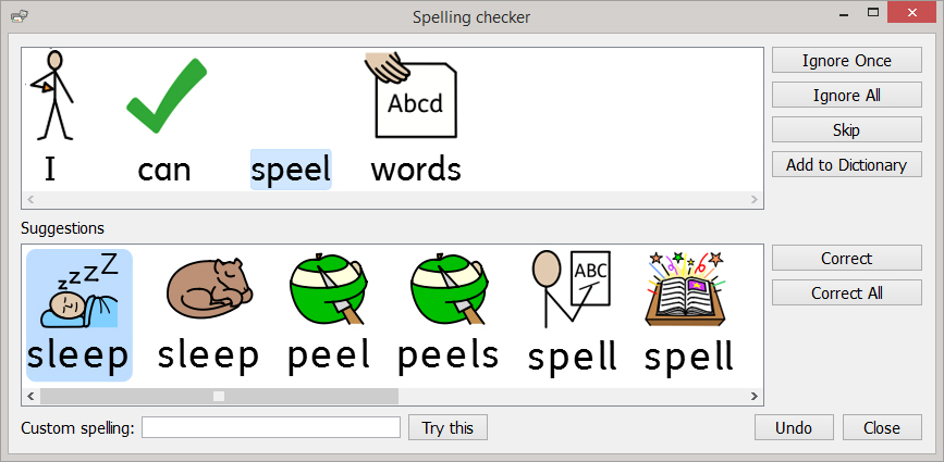
Correcting the Spelling Mistake
If the correct spelling appears in the suggestions, select the Correct button to update the document. You can also select Correct All to changes all instances of that spelling error in the document.
If the suggestions do not contain the word you are looking for, you can search by typing into the Custom spelling box and clicking Try this. This will populate new suggestions based on the searched phrase.
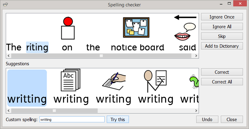
![]()
Other Options
If the marked error isn't a spelling mistake, for example a surname the dictionary doesn't know about, you have additional options.
-
Ignore Once - Ignores this instance of the spelling mistake
-
Ignore All - Ignores all instances of this mistake
-
Add to Dictionary - Adds the typed word to the dictionary as a correct spelling
-
Skip - Moves on to the next mistake
Personalise the Spell Checker

Edit Your Custom Dictionary
To edit your dictionary go to the Symbols tab and select Edit Dictionary.
You can edit your custom dictionary by adding in correct words the spell checker doesn't know about. This may include place names and surnames.
You can also delete spelling corrections that have been added by mistake.
If there are lots of entries, you can use the Find box to search more easily.
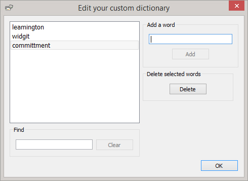
Edit the Spell Checker Suggestions
It is possible for you to create your own suggestions for spelling errors.
Some spelling errors could be due to a phonetic approach of writing, for example 'muvver' could be written instead of 'mother'. The spell checker can only analyse letters, sometimes the suggested corrections will not be accurate for the actual intended word.
To edit the suggestions go to the Symbols tab and select Edit Suggestions.
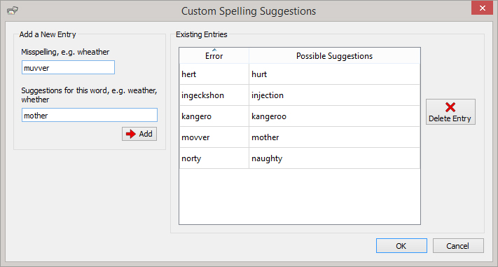
Use the Add a New Entry section to add a new error, and subsequently enter any suggestions for this word separated by a comma.
You can also update existing entries by selecting them from the Existing Entries section and entering new suggestions. When you click on an existing entry, the Add button will be replaced by an Update button.
Click Delete Entry to remove a selected/highlighted entry.
Technical Support

To help you get the most out of InPrint 4, we have provided a number of materials you can either access directly through the program or via http://www.widgit.com/support. These materials include videos, helpsheets, FAQs, manuals, installation guides and links to online training sessions.
If you have a problem with InPrint 4 or would like some help using the software, our support team are on hand:
Tel: (+44) 1926 333686
Email: [email protected]
Finding your Serial Number
You can find your License key/Serial Number by select About… from the Help Menu at the top right of the application.
Installation

InPrint 4 can be installed with the latest installation files which can be downloaded from https://www.widgit.com/support/inprint4/.
The installation files are available in two formats:
-
.exe files for standalone installations
-
.msi files for network installations
Once Installed, InPrint 4 needs to be activated. This is done when InPrint 4 is run for the first time. Activation will attempt to use your internet connection. If your computer does not have a working internet connection, you can still activate your copy of InPrint 4 via Manual Activation. See our activation guide on www.widgit.com/support/inprint4/download.htm for more information.
It is recommended to install the standalone (.exe) installer when physically installing InPrint 4 onto a machine and the network (.msi) installer when deploying InPrint 4 on a network.
Default Paths to File Locations
Below is a list of default file locations used by InPrint 4, please note some of this may change if you have chosen a custom or network installation option.
Shared Documents:
C:\Users\Public\Documents\Widgit InPrint 4\InPrint
Personal Documents:
C:\Users\%username%\Documents\Widgit InPrint 4\InPrint
(where %username% is a variable that Windows will substitute.)
Resource Packs:
C:\Users\Public\Documents\Widgit InPrint 4\InPrint\Resource Packs
Templates:
C:\Users\Public\Documents\Widgit InPrint 4\InPrint\Templates
Topic Wordlists:
C:\ProgramData\Widgit InPrint 4\Common Files\Topic Wordlists
Symbol Set Wordlists:
C:\ProgramData\Widgit InPrint 4\Common Files\Symbol Set Wordlists
InPrint 2 Wordlists:
C:\Users\Public\Documents\Widgit InPrint 4\Communicate Files\Wordlist
Presentation Export

Export InPrint 4 documents as slideshow presentations
What is Presentation Export?
Presentation Export allows you to export documents created in InPrint 4 as slideshow presentations. These presentations can be opened with Microsoft PowerPoint, Google Slides, and other presentation software. Enhance your presentations with symbols by using over 80 pre-made templates and example resources, including classroom activities, symbol information books, quizzes, and so much more.
Presentation Export is available with an InPrint 4 subscription, with the Standard Tier and above. See more about subscriptions.
Getting Started with Presentation Export
A getting started guide is available from within the Presentations folder in the Templates or Resource Pack area. It is also available from our website: Click here to view it.
Visit www.widgit.com/presentations to see hints, tips, and common questions.
Exporting Presentations
Documents can be exported as presentations from the File Tab and/or Print button.
When editing a document that is using a presentation paper size, or has presentation features enabled, the Export Presentation button will be present on the Print Preview.
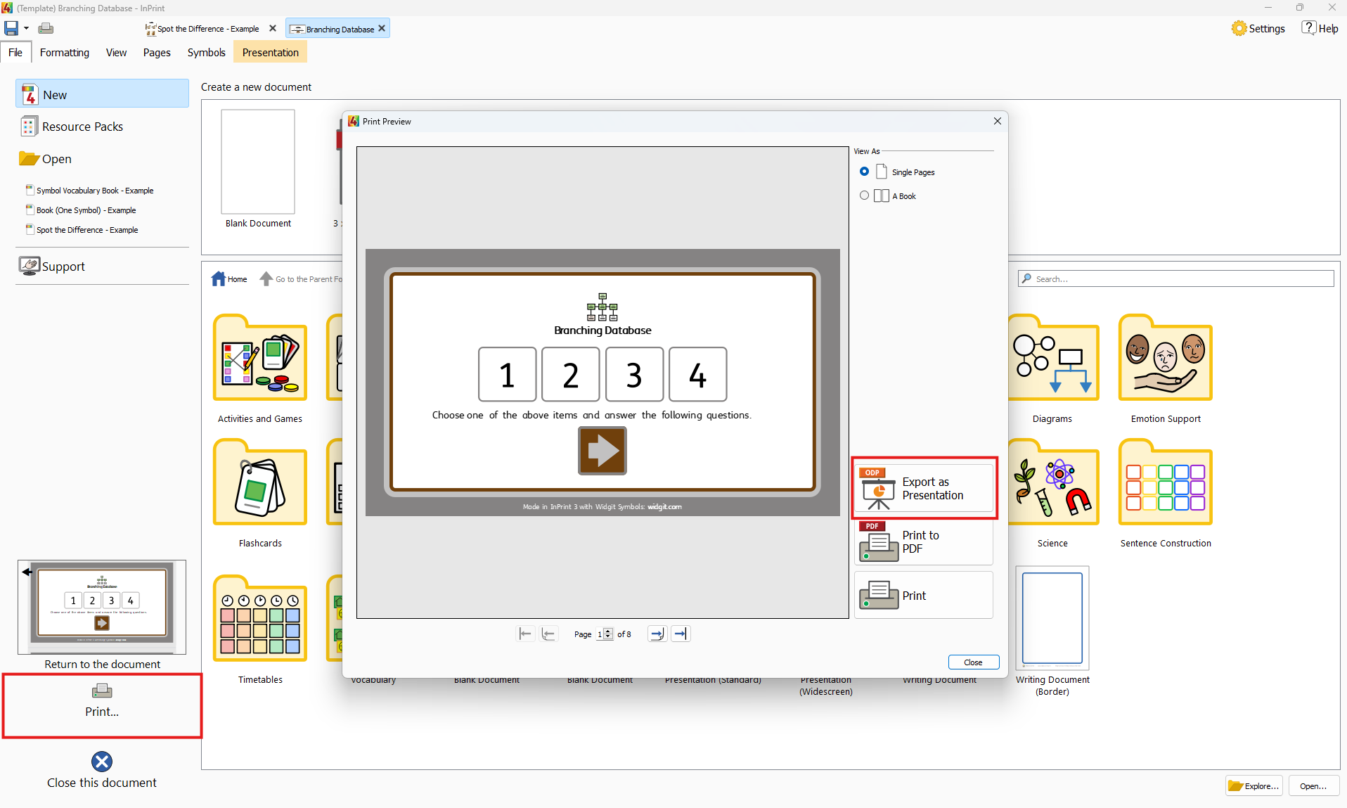
Clicking the Export Presentation button will prompt the document to save, and open a dialog to specify where the presentation document will be saved. By default, the presentation will have the same name as the InPrint 4 document and will open after it has been saved.
Presentation Paper Sizes and Enabling Presentation Features
In order to be able to export a presentation, the InPrint 4 document needs to have presentation features enabled. This happens when an InPrint 4 document is using a presentation paper size or has specifically enabled presentation features.
Presentation Paper Sizes
The paper size can be set from the Pages Tab. Clicking on the Paper Size button will show all available paper sizes.
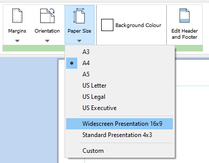
Selecting either Widescreen or Standard Presentation paper sizes will enable presentation features. This will show the Presentation Tab and allow the InPrint 4 document to be exported as a presentation from the File Tab.
Presentation Features
Existing documents can be exported as a presentation by manually enabling presentation features for that document. To do this, open the document and select Custom from the Paper Size button on the Pages Tab. This will open the Page Setup dialog.
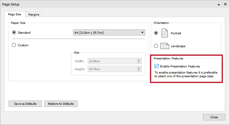
Check Enable Presentation Features to allow the document to be exported as a presentation. This will show the Presentation Tab and allow the InPrint 4 document to be exported as a presentation from the File Tab.
Using Presentation Resources and Templates

Presentation Export comes with over 80 pre-made templates and resources. You can find them in the Resource Pack and Templates area, from the File Tab.
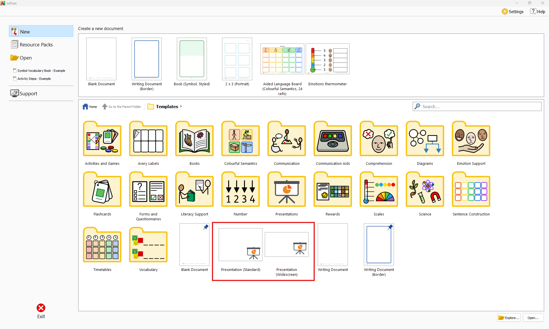
All our presentation resources were made using the provided templates. To see which resource uses which template, read our guidehere.
Presentation Widgit Media
Presentation specific Widgit Media have been added to help build presentations. To access them, click on Widgit Media in the Image Library at the bottom-right when editing an InPrint document, and select the Presentation folder.
The presentation Widgit Media provide a selection of Backgrounds and Buttons.
Backgrounds are provided for both standard and widescreen resolutions and will snap to any presentation document that matches that aspect ratio.
Buttons are images that can be used for navigation, and are provided in over 15 different styles and colours.
To add a background or button, click and drag the item from the Image Library into your document.
Changing the background of a template or resource
Many of the templates or presentation resources provided use backgrounds and buttons from Widgit Media. Background images can be placed in the Header and Footer so they appear on each slide.
To add or change a background image:
-
Go to the Pages Tab
-
Click Edit Header and Footer to open the Header and Footer
-
In the Image Library, navigate, by clicking on each folder to:
-
Widgit Media / Presentations / Backgrounds / 4:3, or
-
Widgit Media / Presentations / Backgrounds / 16:9
-
Navigate through the different images to find one to use
-
Click and drag the image over a slide, so that the image snaps to the edges of the slide
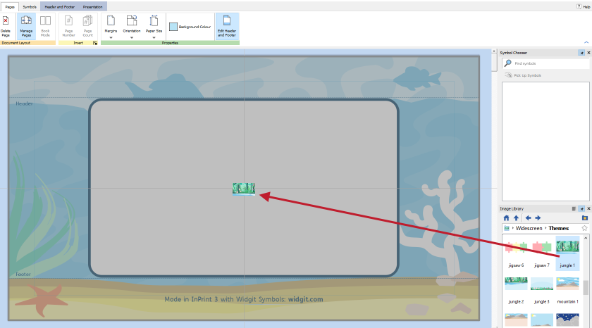
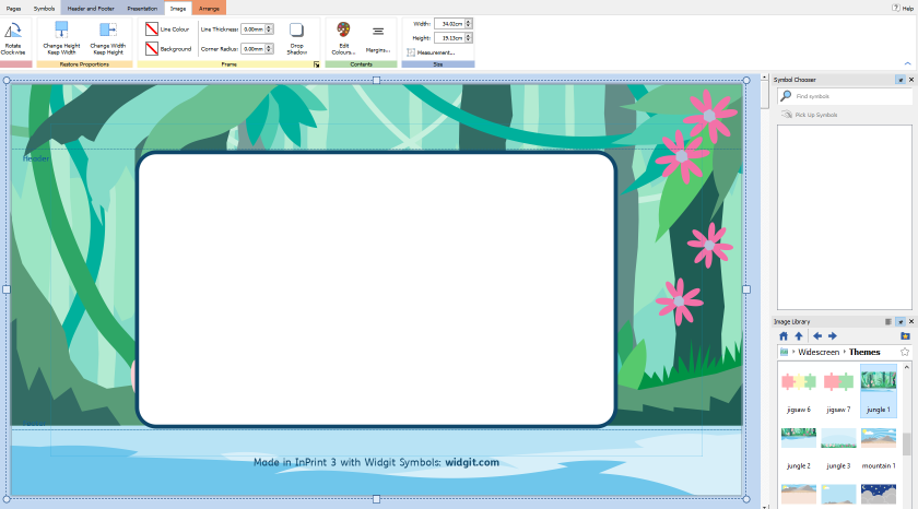
The background images come in specific sizes. They may need to be resized to fit the current page size of the document being edited.
Presentation Tab

When editing a Presentation document, you will see the Presentation Tab appear on the Tab bar. The presentation tab provides additional functionality to use when creating presentation documents in InPrint 3.
Read more about what each section does:
Linking
Links allow objects, when clicked, to navigate to a specific slide or open a browser to a webpage. When the document is exported, the links will be viewable and editable in the presentation software used.
Links can only be added to Frames and Entire Tables.
Adding a link
To add a link, select a Frame or Table and click on the Presentation Tab. Select either:
-
Add Web Link
-
Add Link To Slide
This will open a dialog to add the link. For Web Links, a text box will appear to enter the address for a webpage. The https protocol will be added by default if not specified.
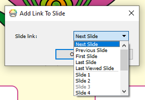
-
Next Slide (The next slide in the document)
-
Previous Slide (The previous slide in the document)
-
First Slide (The first slide in the document)
-
Last Slide (The last slide in the document)
-
Previous Viewed Slide (The last slide that was viewed)
-
A specific slide number
Clicking OK will add the slide link. A link indicator will appear in the selection decoration for the object.
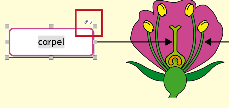
Editing a link
Links can be edited by selecting an object with a link and clicking Edit Link on the Presentation Tab. This will bring up the Edit Link dialog with an option to change the link. Links can be modified to a web link to a slide link at this stage.
Removing a link
Links can be removed from an object by selecting the object with a link and clicking Remove Link on the Presentation Tab. This will remove the link.
Testing a link
Links can be tested in InPrint, before a document is exported, by left-clicking on the link indicator in the selection decoration and selecting Follow Link. This will navigate the InPrint document to the slide linked, or open a web browser to show a webpage.
Splitting a table to link individual cells
Tables can be split into multiple frames from the Table Layout Tab or Arrange Tab. This will allow for a table-styled layout with specific frames linking to specific items.
To do this, select a table and click on the Split Table button on the Table Layout Tab or Arrange Tab.
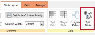
This will convert a table into multiple frames. Each frame can then be used to add links to.
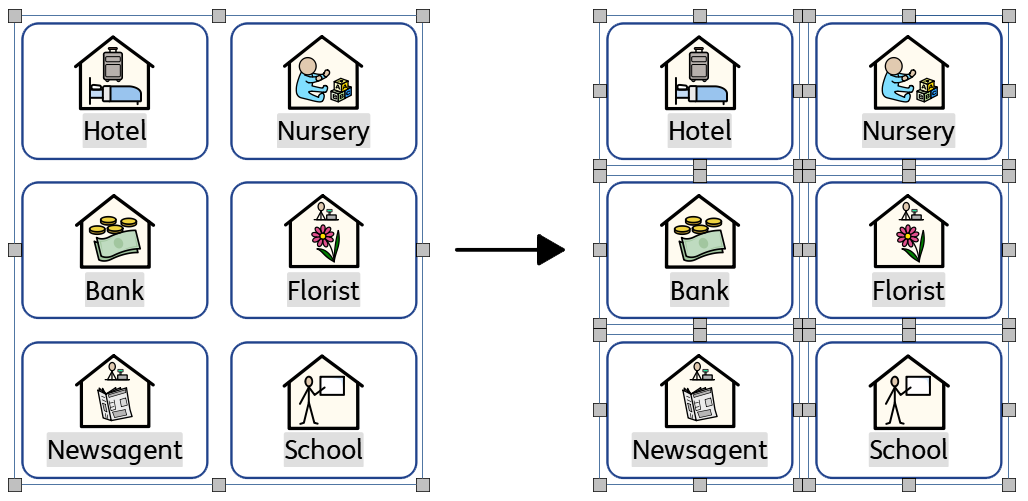
Manage Slides
When loading a Presentation document, the Page Manager will appear vertically on the left-hand side.
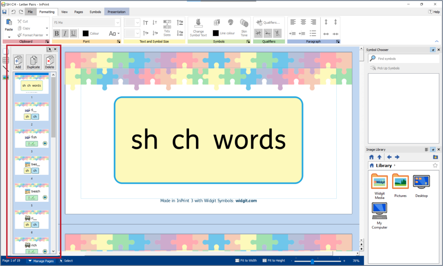
Slides can be added or removed from the Presentation Tab. Slides can be added, removed, duplicated, and rearranged from the Page Manager.
When slides are added or duplicated, any links will update appropriately. For example, if slide 1 linked to slide 3, and a slide was added before slide 3, slide 1 will now link to the new location of the slide it previously linked to. In this case slide 1 will now link to slide 4.
When slides are removed, any links to that slide will be removed.
Duplicating slides with links
Many of the presentations resources come with sets of pages, for example a question and answer set of pages. These may link between each other. When using a template or resource like this, duplicating the set of pages together will keep the slide links correct and allow you to add another question in the same way.
To do this, multiply-select all pages in the page set by using the CTRL or SHIFT key when clicking in the Page Manager. Selected pages will have a blue highlight. When you are ready, click the Duplicate button in the Page Manager. The slides will be duplicated after the selection.
Slide Background Colour
The background colour of a slide can be changed from the Presentation Tab. Clicking the Background Colour button will open a colour picker. Selecting a colour will change the background colour of the current selected page.
New pages will use the background colour of the previous page.
The background colour can be changed for multiple slides by multiply-selecting more than one slide in the Page Manager and selecting a colour from the Background Colour button on the Presentation Tab.
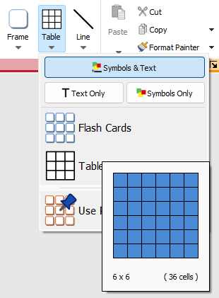
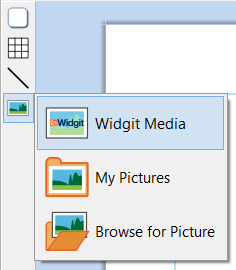
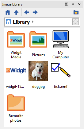
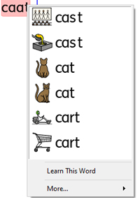
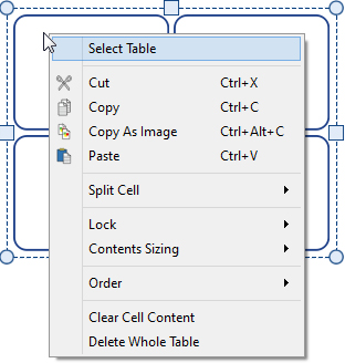
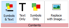
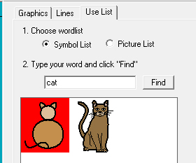
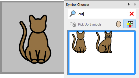
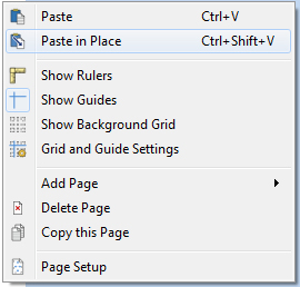
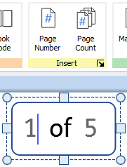
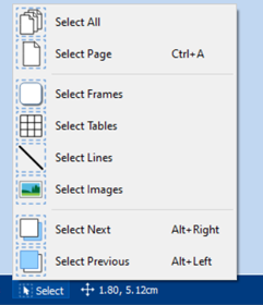
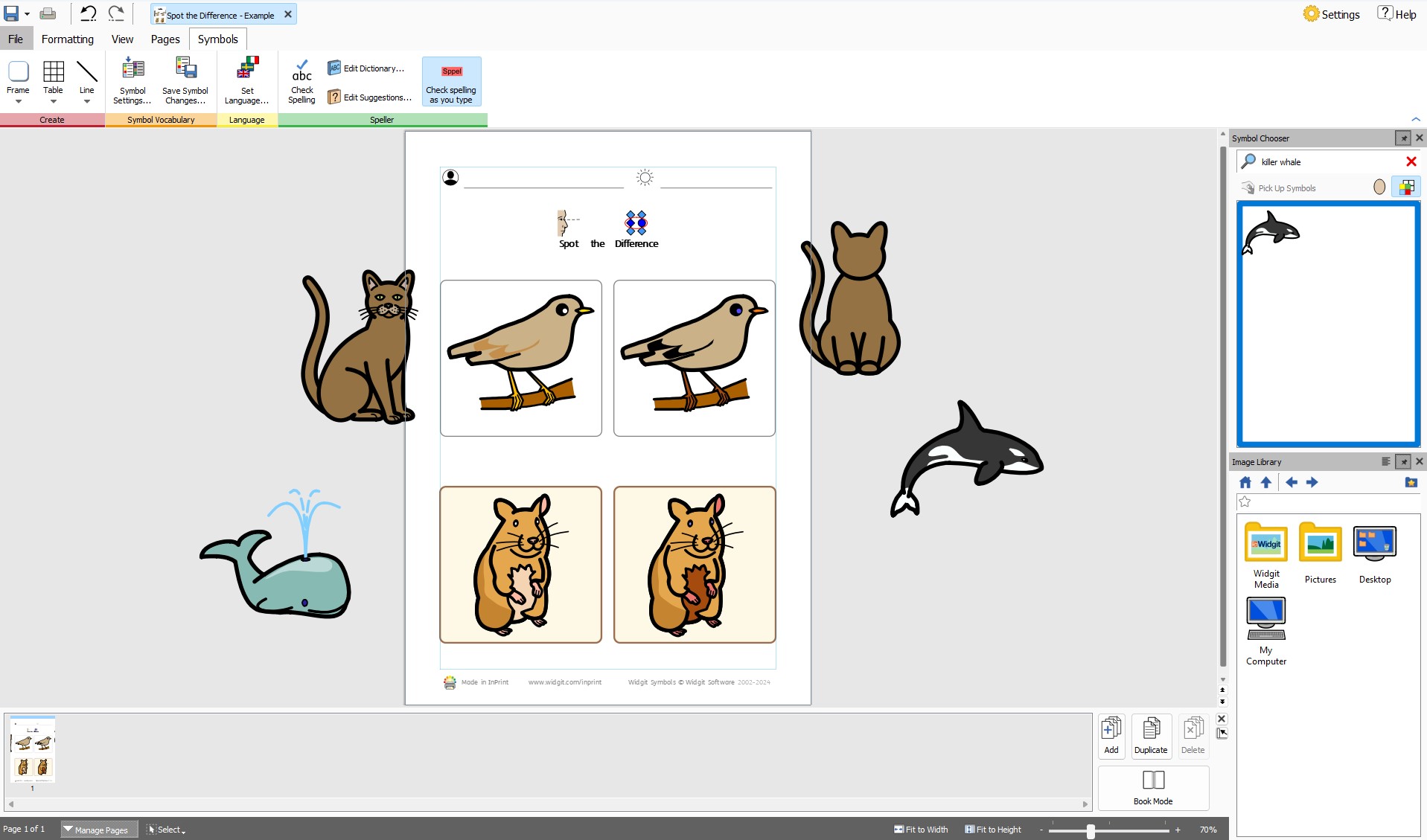


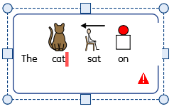


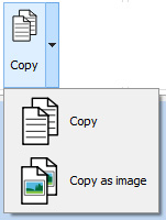
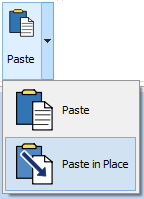
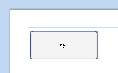
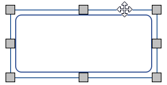
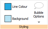
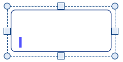
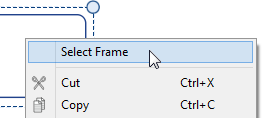
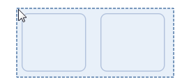
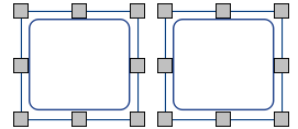
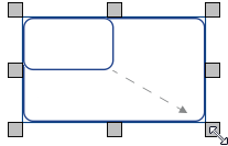


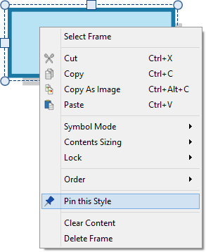
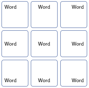


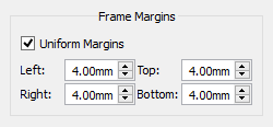
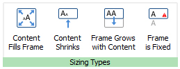

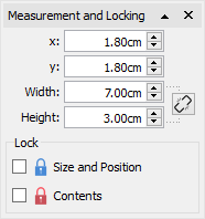

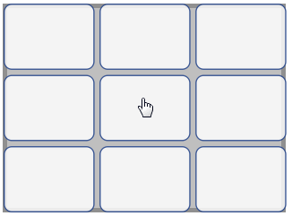
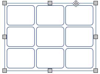
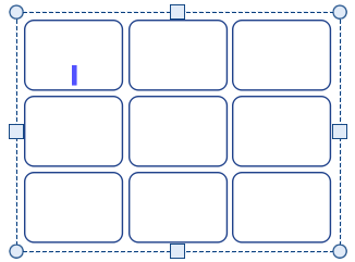
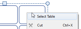
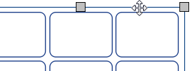
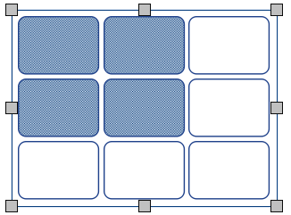
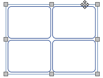


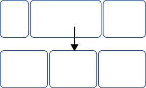


 Add Row Above
 Add Row Below


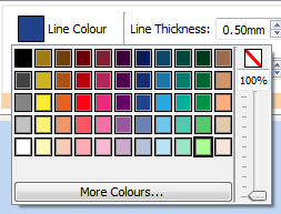


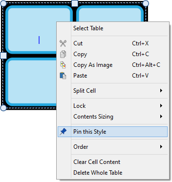


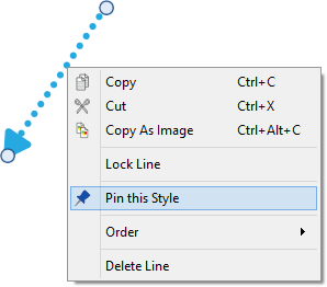
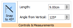
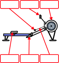


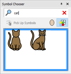
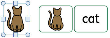

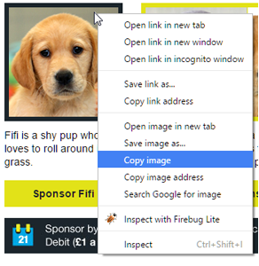
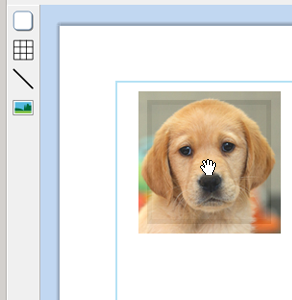
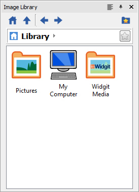
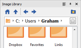
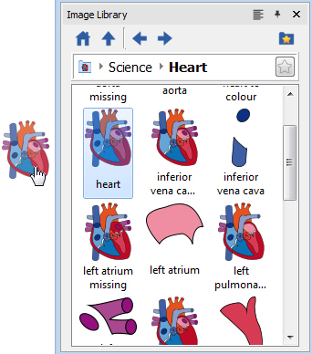

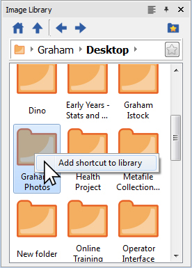
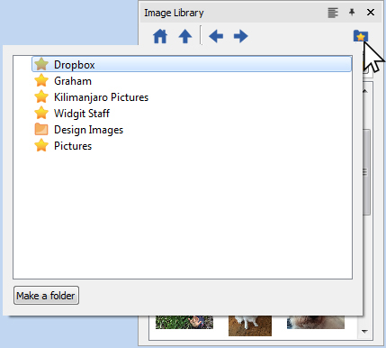
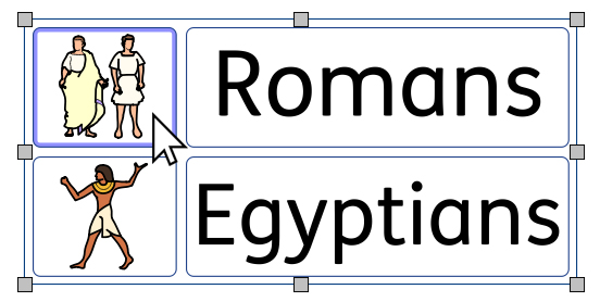


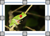
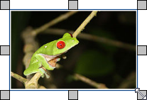


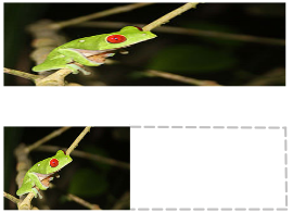


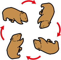

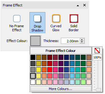
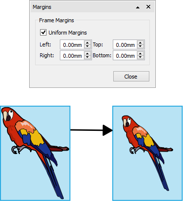








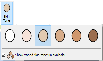

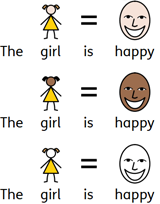


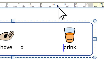
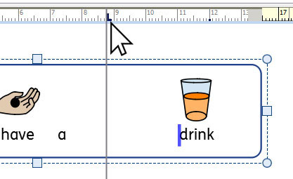
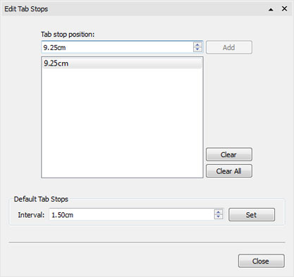




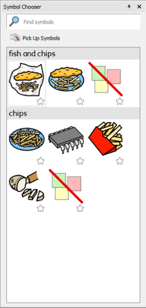
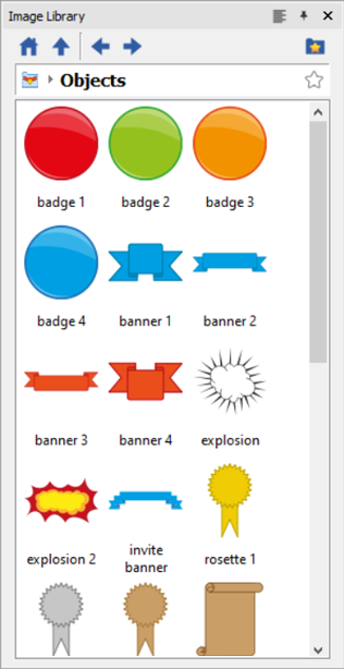


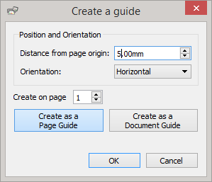
 The Grid and Guide Settings allow you: